CLIENT CASE STUDIES
Below is a shortlist of clients I've personally transformed.
CASE STUDY
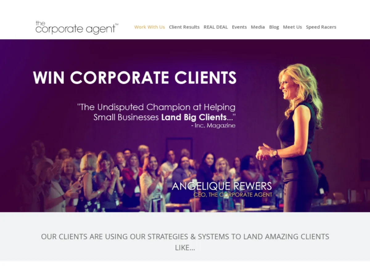
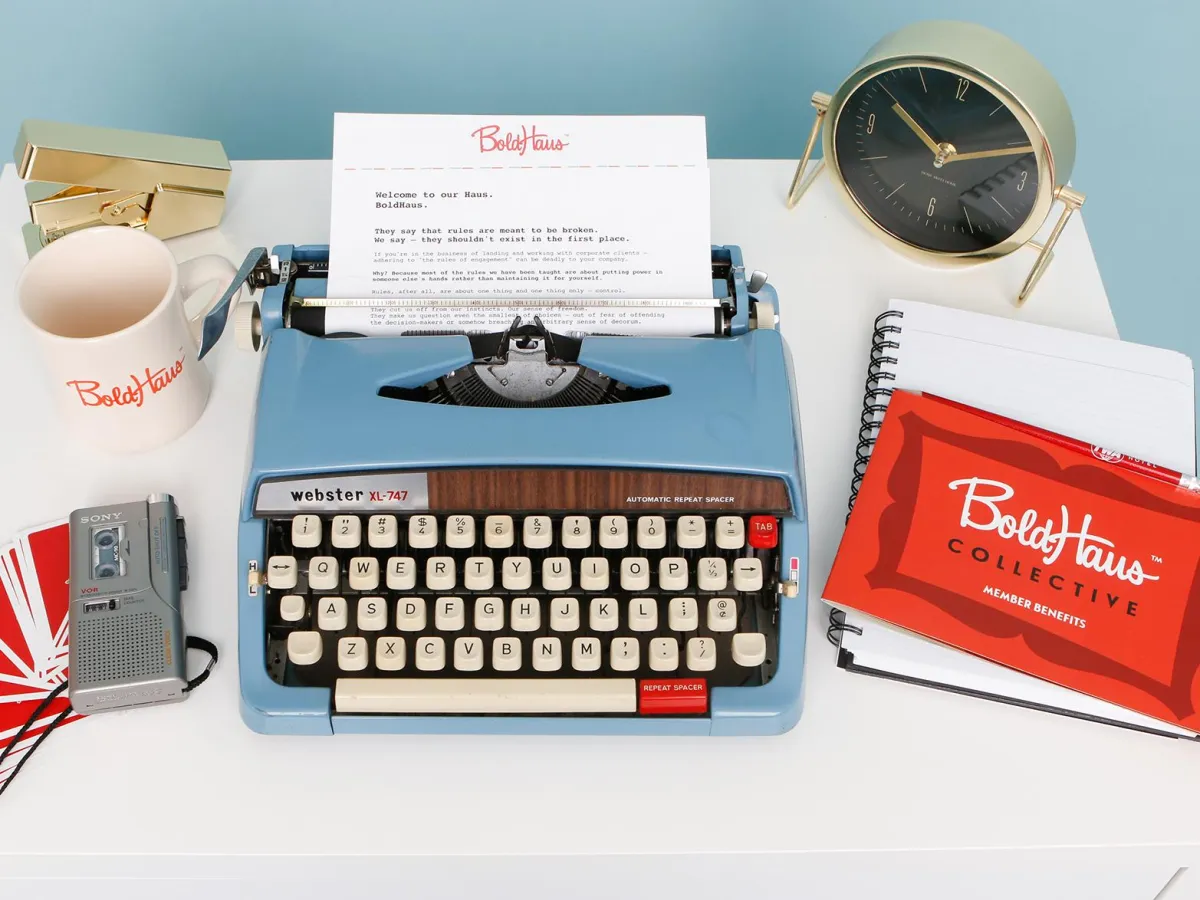
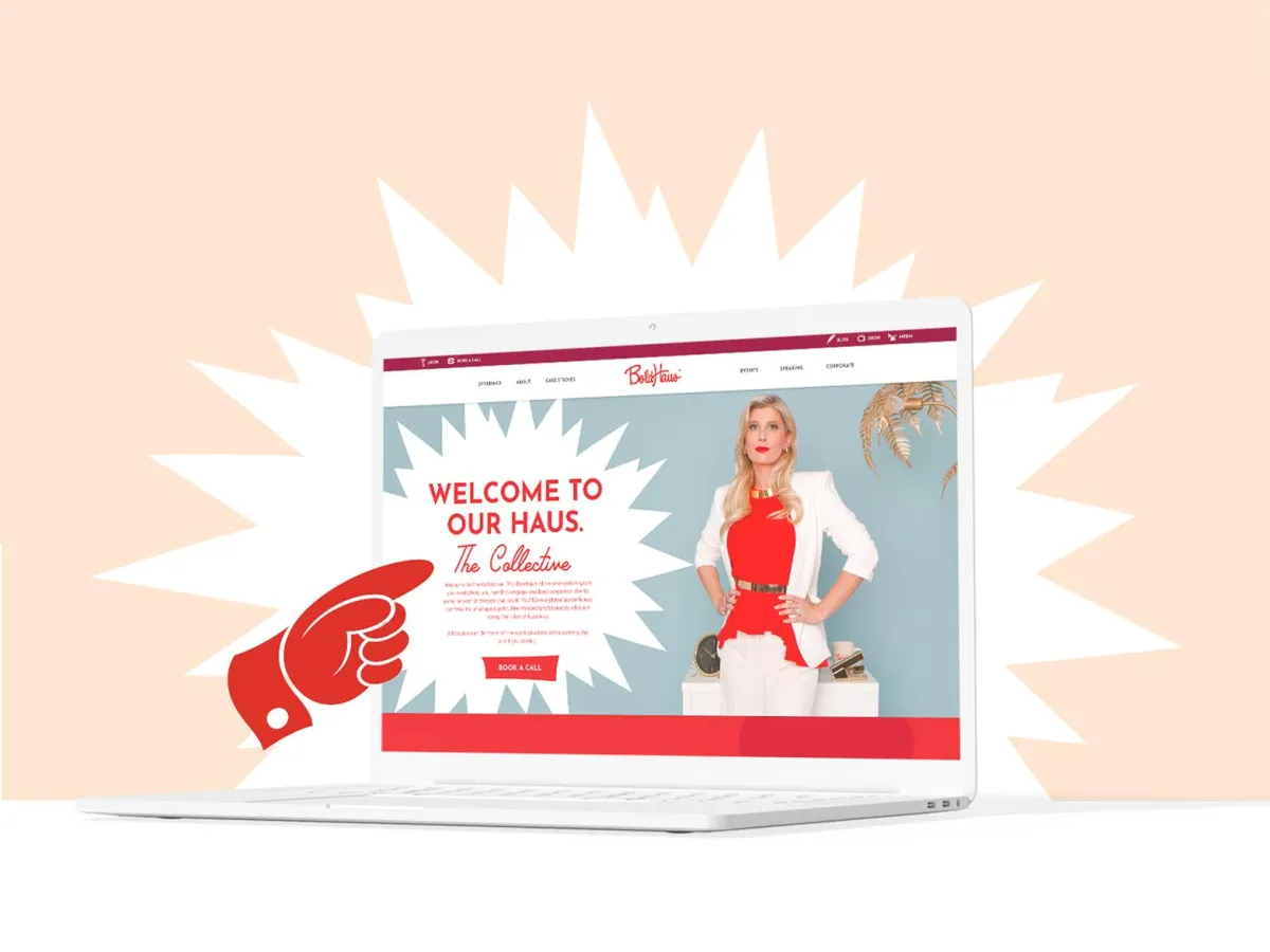
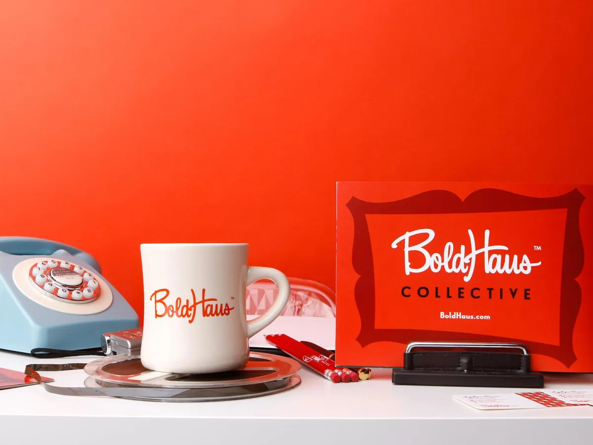
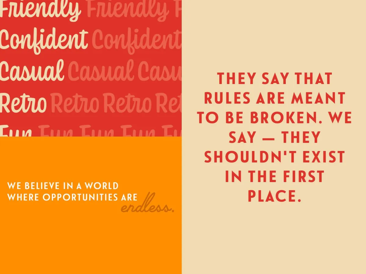
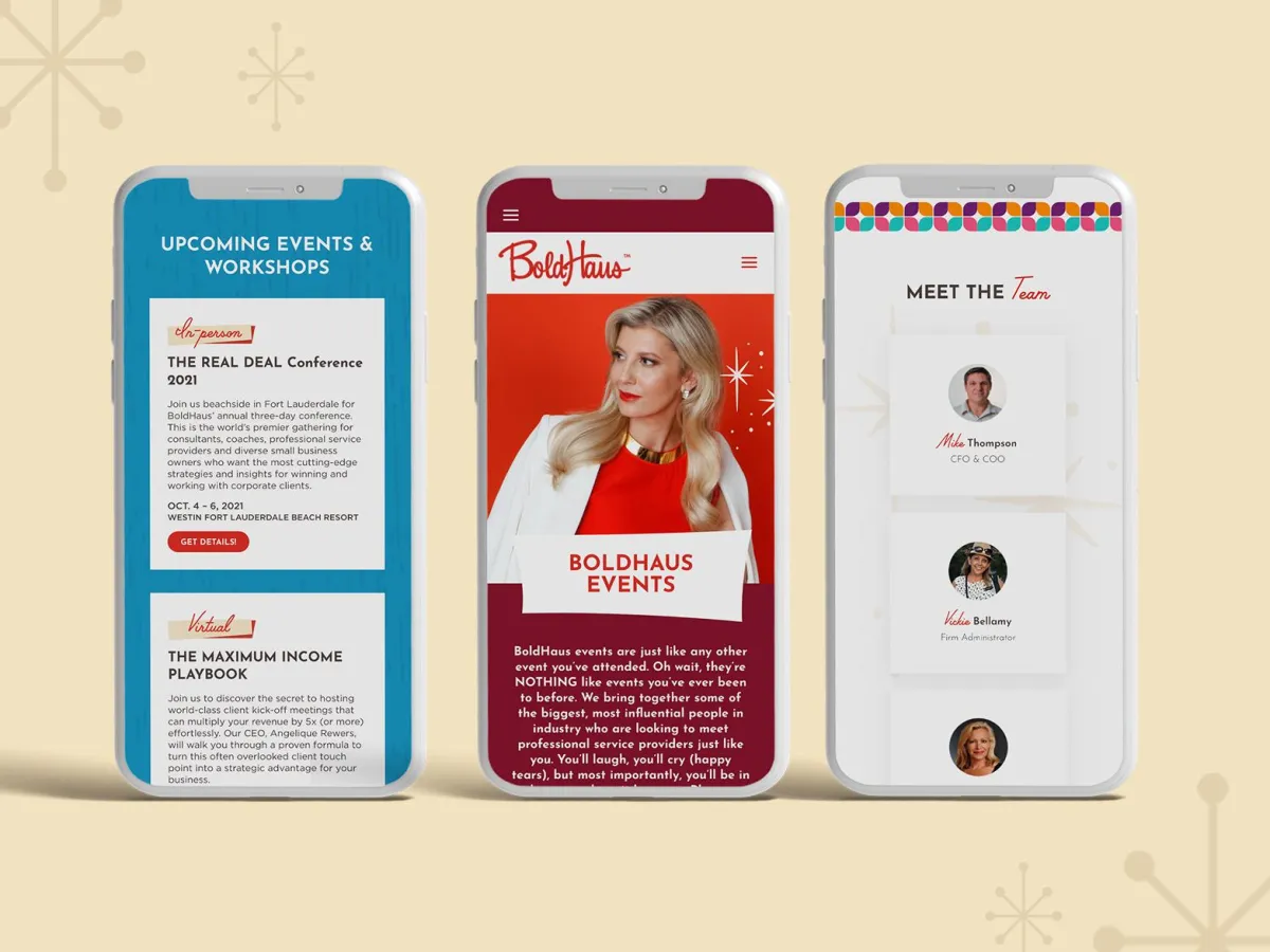
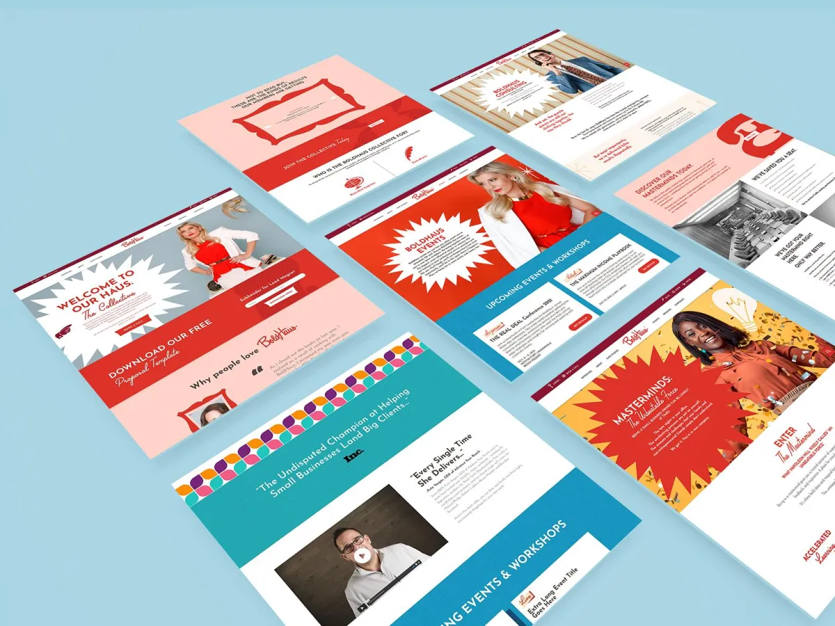
BOLDHAUS
From "Safe" Consultant to Market Disruptor
The Challenge. Despite years of success, Angelique Rewers’ brand (The Corporate Agent) felt too safe. It reflected where she had been, not where she was going. She needed a brand that matched her unapologetic edge and commanded instant authority with Fortune 500 stakeholders.
The Strategy & Execution. We moved beyond a simple rebrand to Identity Architecture. By transitioning to BoldHaus, we shifted the narrative from "service provider" to "powerhouse."
> Renaming: Engineered a name that implies structure, legacy, and fearless innovation.
> Visual Edge: Developed a high-contrast identity designed to cut through corporate noise.
> Market Positioning: Aligned her visual presence with her role as a confident disruptor.
The Result. BoldHaus isn't just a new look; it’s a reclamation of market leadership. The brand now exudes the "unmistakable authority" required to lead the industry’s most important conversations.
The Before

The After


CASE STUDY
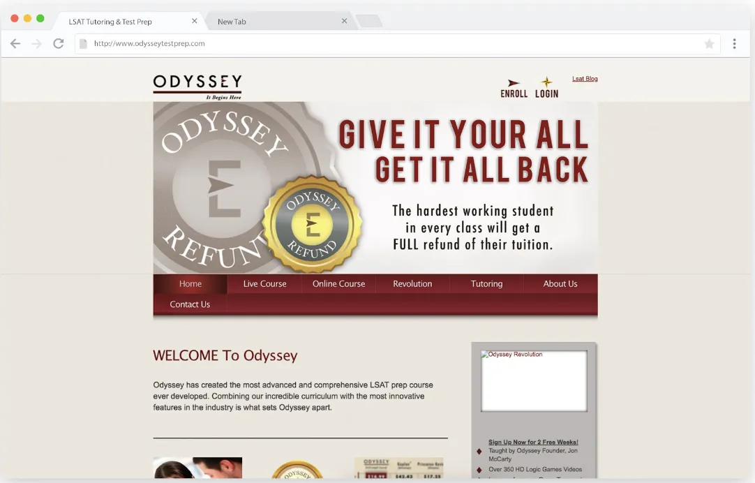
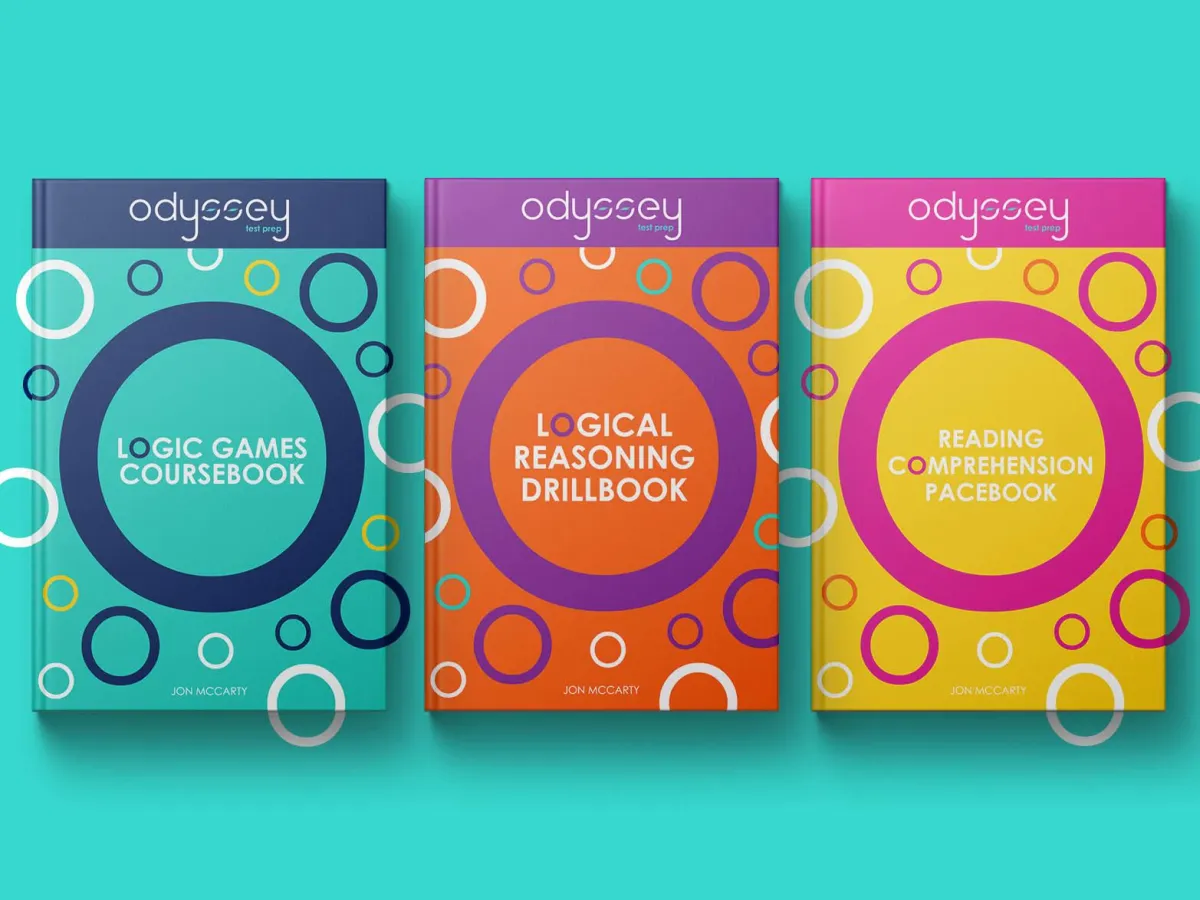
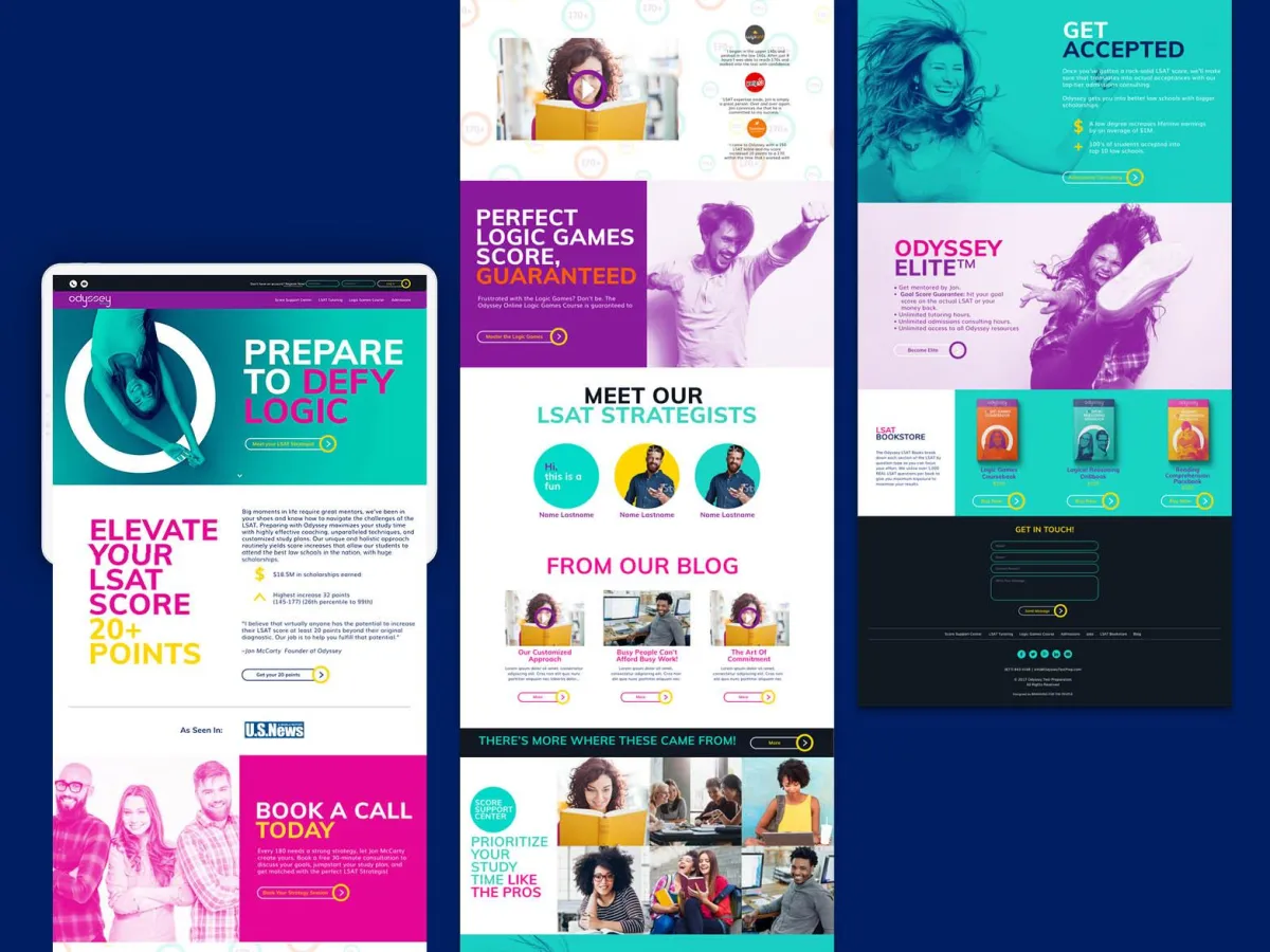
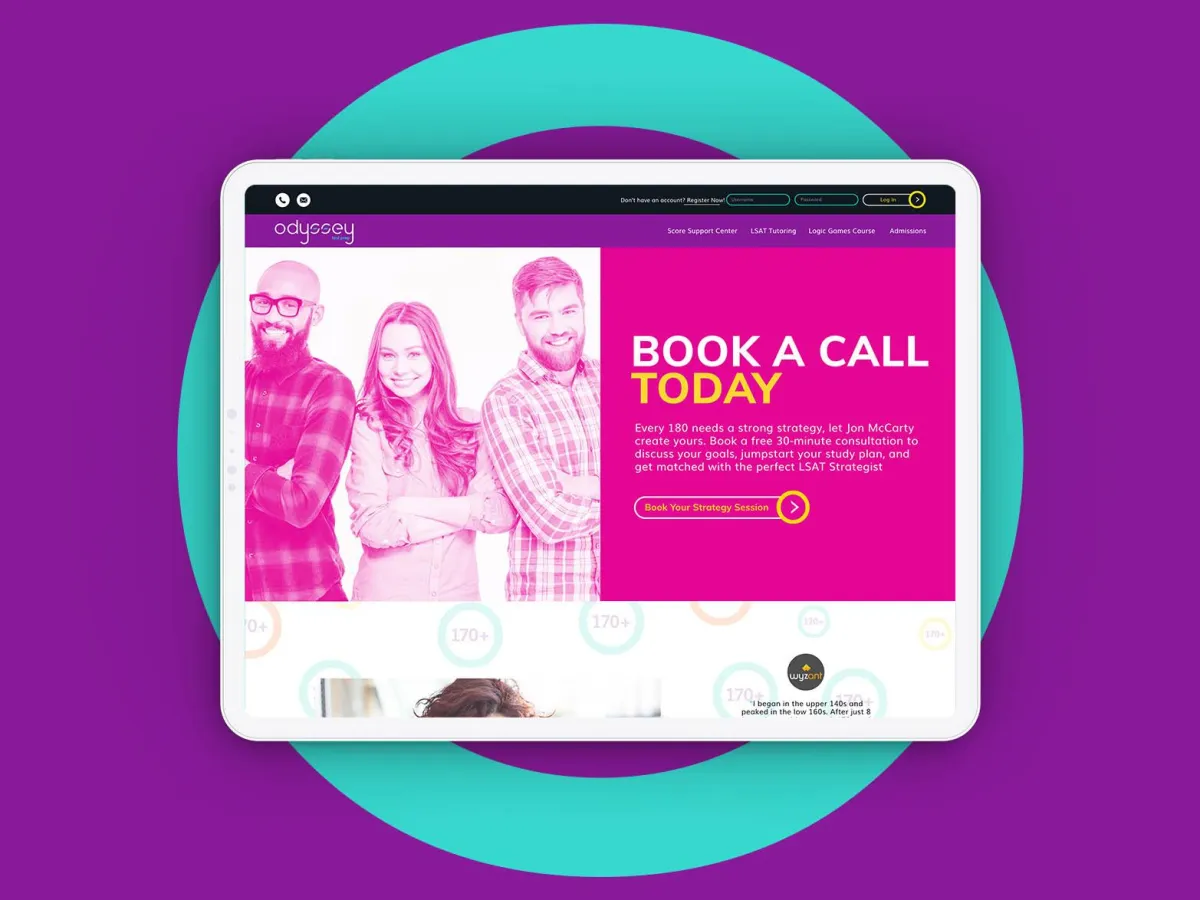
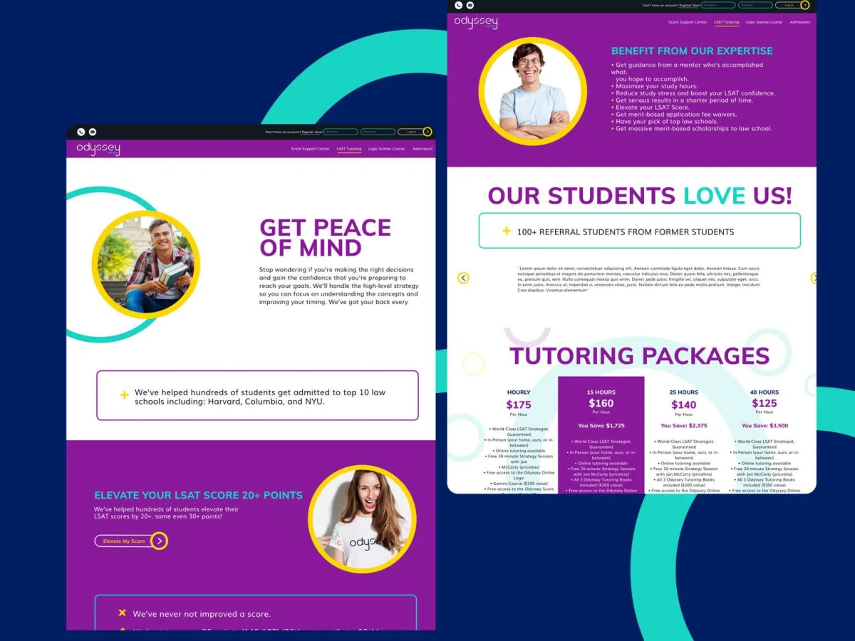
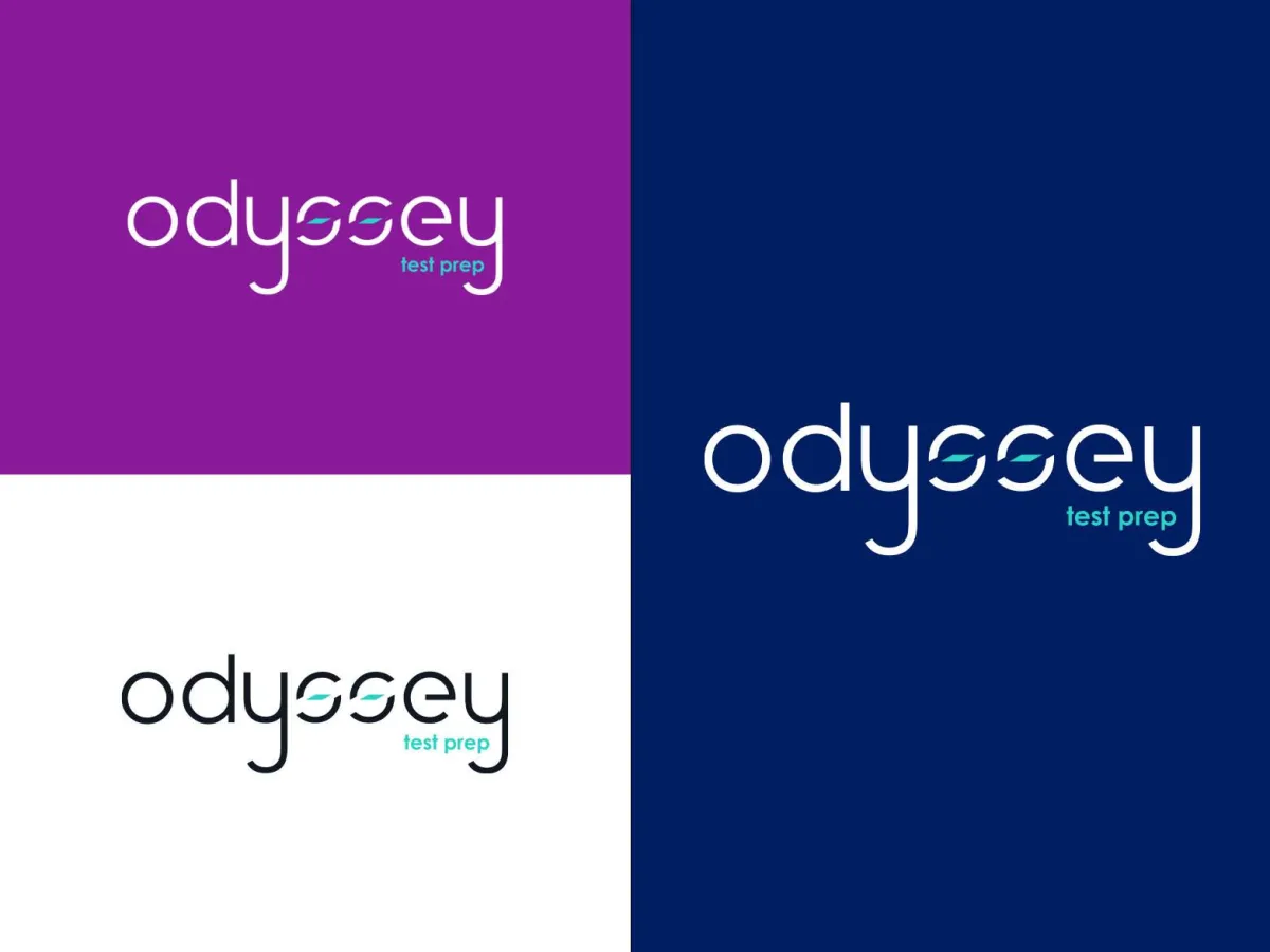
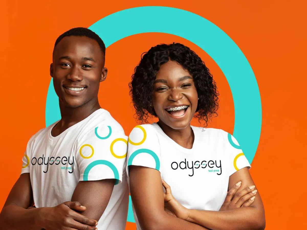
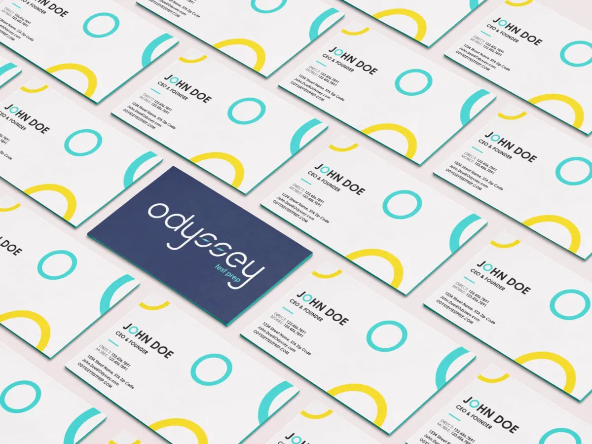
ODYSSEY TEST PREP
From DIY Identity to 10x Revenue Growth
The Challenge. Odyssey Test Prep delivered exceptional LSAT outcomes, but its brand told a different story. CEO Jonathan McCarty was operating with a DIY identity that lacked the credibility of his high-performing program. To scale, he needed a premium brand that could mirror the excellence of his results and command the attention of elite law school candidates.
The Strategy & Execution. We executed a full brand transformation to align Odyssey’s outer image with its inner excellence. By shifting the positioning toward high-achieving scholars, we turned a tutoring service into a premier educational partner.
> Premium Reimagining: Developed a sophisticated visual identity that resonates with the caliber of high-stakes law school applicants.
> Strategic Positioning: Moved the brand from "DIY" to "Elite," establishing instant trust and academic authority.
> Transformation Architecture: Created a cohesive presence that allowed the brand to scale beyond the founder’s individual efforts.
The Result. The transformation provided the foundation for massive scaling. Since the rebrand, Odyssey has grown nearly 10x in revenue and successfully attracts the high-tier clientele the company was always destined to serve.
The Before
The After

CASE STUDY
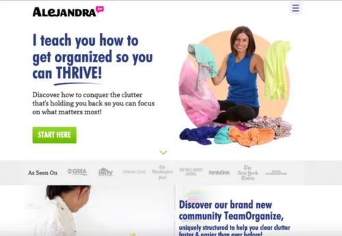
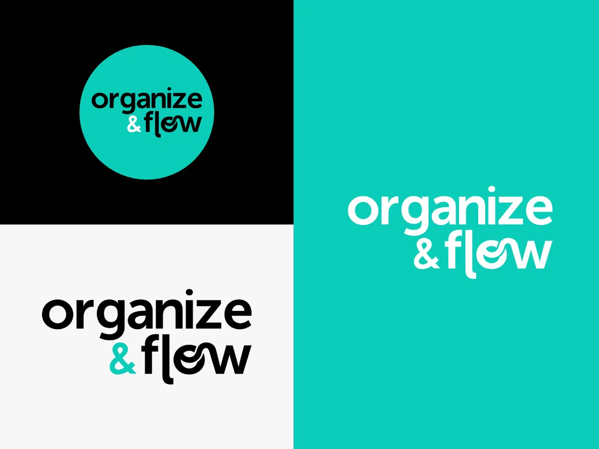
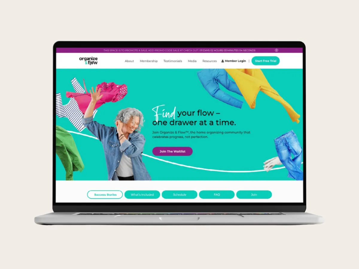
ORGANIZE & FLOW
From Personality Brand to Global Movement
The Challenge. After building a massive YouTube following and membership, Alejandra and Ed realized their brand had outgrown its original identity. "Alejandra.tv" felt too small for the scale and soul of their mission. They needed to evolve beyond a personality-driven site into an expansive, enduring brand that could house a growing movement of intentional living.
The Strategy & Execution. We partnered to architect a "Masterbrand" capable of scaling without losing the heart of their message. The focus was on shifting the brand from a person-centric model to a lifestyle-centric philosophy.
> Strategic Renaming: Transitioned to Organize & Flow, a name that bridges the gap between physical decluttering and emotional liberation.
> Masterbrand Architecture: Designed a scalable system to elevate the user experience across their YouTube channel, membership, and web presence.
> Identity Evolution: Created a magnetic, soulful visual identity that positions the brand as a leader in the empowerment space.
The Result. Organize & Flow is no longer just a channel; it is a scalable movement. The new identity has successfully liberated the brand from its original constraints, allowing it to reach more people and empower them to live with clarity, self-expression, and flow.
The Before
The After
CASE STUDY
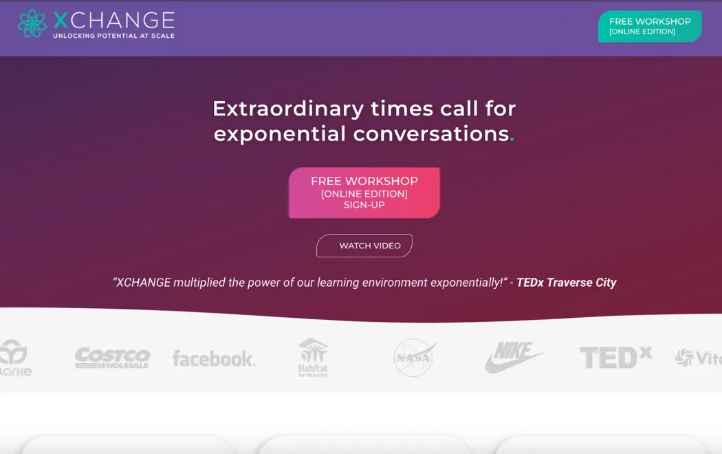
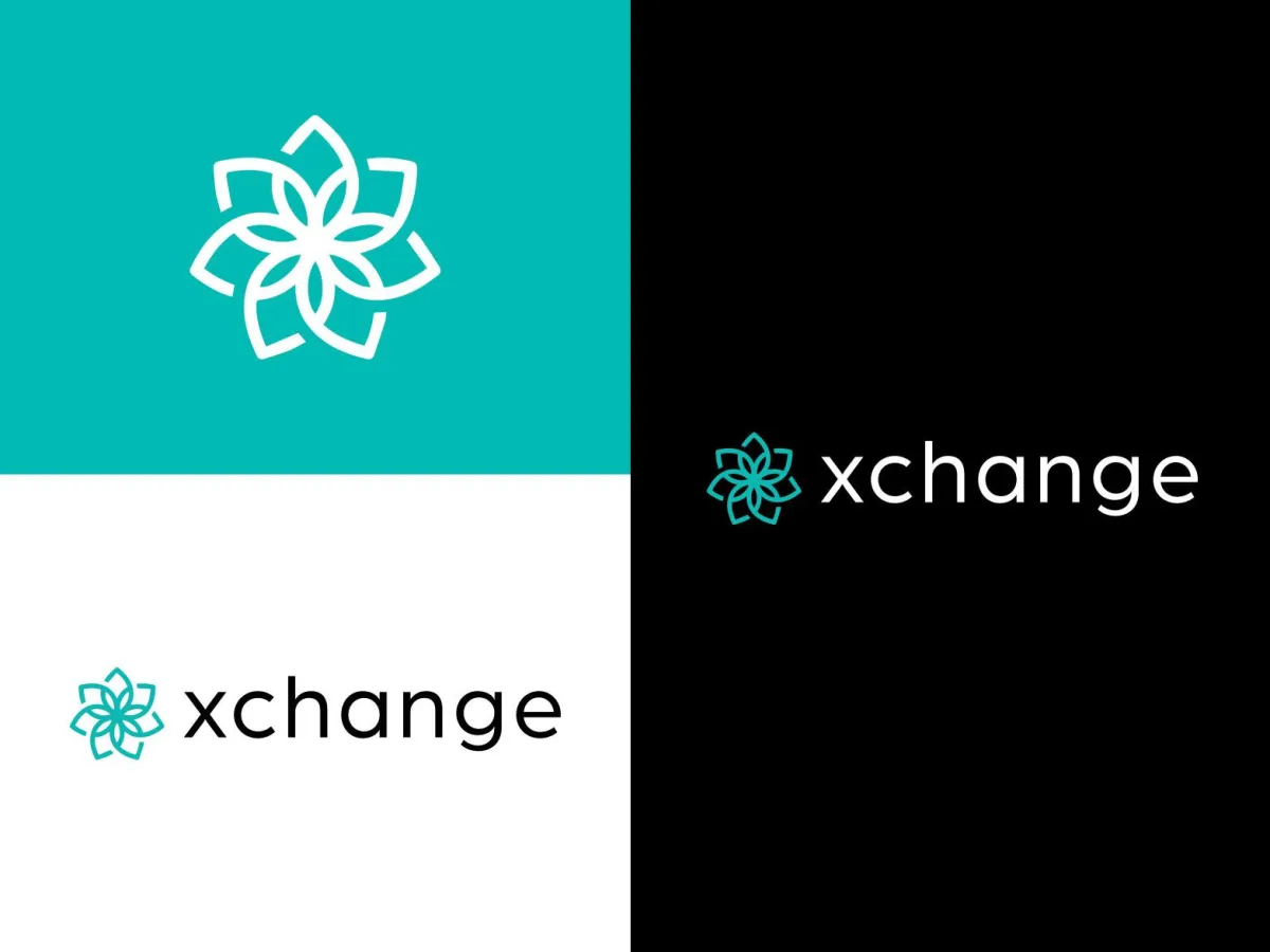
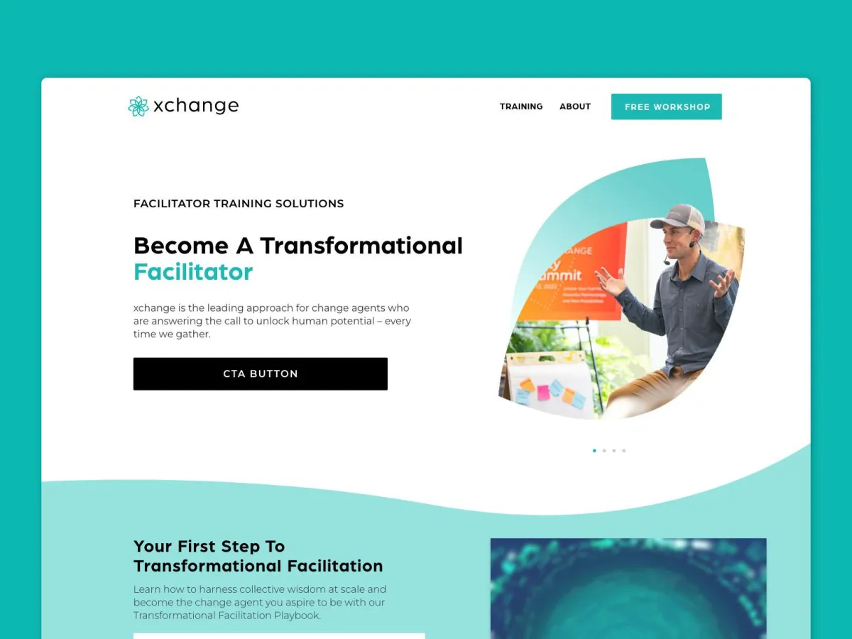
xchange
Unlocking Human Potential At Scale
The Challenge. After building a massive YouTube following and membership, Alejandra and Ed realized their brand had outgrown its original identity. "Alejandra.tv" felt too small for the scale and soul of their mission. They needed to evolve beyond a personality-driven site into an expansive, enduring brand that could house a growing movement of intentional living.
The Strategy & Execution. We partnered to architect a "Masterbrand" capable of scaling without losing the heart of their message. The focus was on shifting the brand from a person-centric model to a lifestyle-centric philosophy.
> Strategic Renaming: Transitioned to Organize & Flow, a name that bridges the gap between physical decluttering and emotional liberation.
> Masterbrand Architecture: Designed a scalable system to elevate the user experience across their YouTube channel, membership, and web presence.
> Identity Evolution: Created a magnetic, soulful visual identity that positions the brand as a leader in the empowerment space.
The Result. Organize & Flow is no longer just a channel; it is a scalable movement. The new identity has successfully liberated the brand from its original constraints, allowing it to reach more people and empower them to live with clarity, self-expression, and flow.
The Before
The After
CASE STUDY
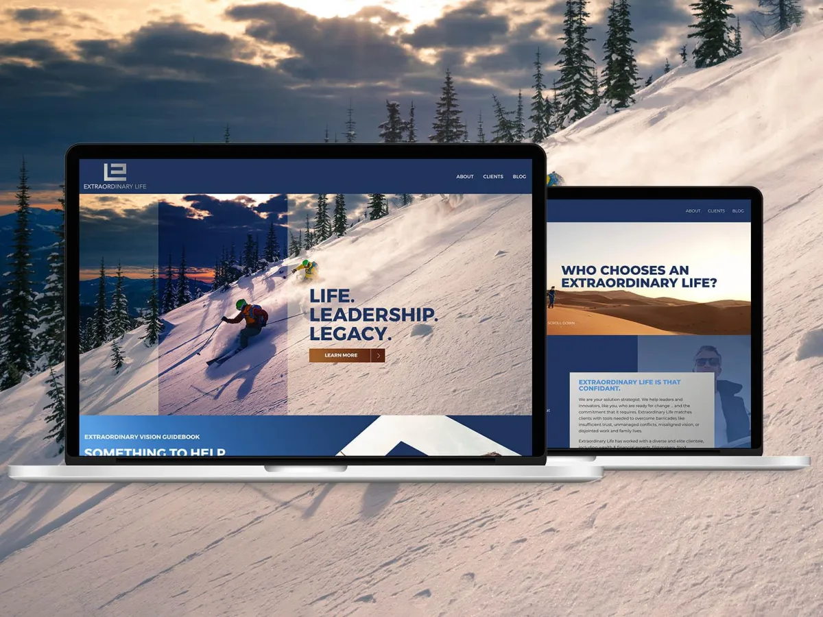
EXTRAORDINARY LIFE
Helping leaders harness their hidden potential.
The Challenge. Extraordinary Life had become a trusted guide for visionary leaders, yet the brand identity lagged behind the transformation Dr. Al Spicer was actually delivering. The existing presence failed to reflect the depth of the work or the caliber of the high-level clientele he served. To reach the next level of legacy-shaping impact, the brand required a complete elevation to match its mission.
The Strategy & Execution. We partnered to bring every touchpoint into full alignment with Dr. Spicer’s sophisticated methodology. This wasn't just a facelift; it was a comprehensive strategic overhaul designed to mirror world-class authority.
> Strategic Renaming: Refined the brand name to better embody the aspiration and result of the partnership.
> Identity Refinement: Developed a visual language that mirrors the caliber, wisdom, and prestige of the leaders in Dr. Spicer’s ecosystem.
> Digital Authority: Built a web presence that acts as a high-authority portal, amplifying his presence and expanding his global reach.
The Result. The transformation has closed the gap between the work and the brand. Extraordinary Life now resonates with deep authority, providing Dr. Spicer with a platform that exceeds expectations and positions him as a premier guide for the world's most visionary leaders.
The Before
The After
CASE STUDY
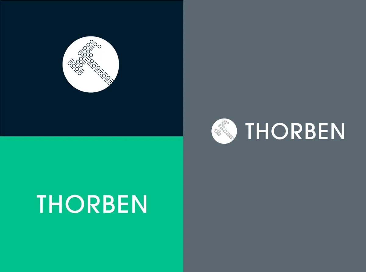
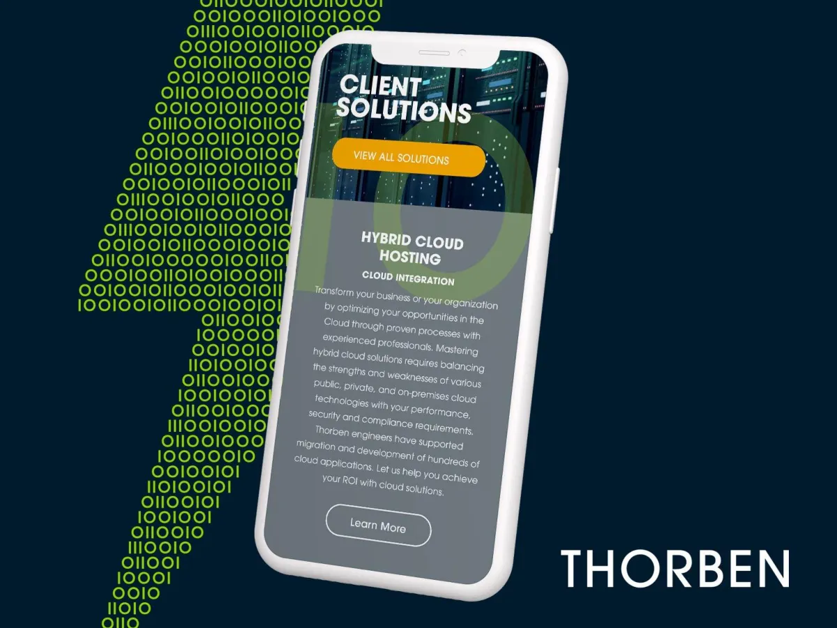
THORBEN
Mastering Innovation Together
The Challenge. Despite being a 100% woman-owned team trusted by major federal agencies, Thorben’s brand reflected a "scrappy upstart" rather than an established authority. This visual and strategic misalignment was capping their growth potential and preventing them from being perceived as the high-caliber firm they had already become. To scale, they needed a brand that could command respect in the highest rooms of government and industry.
The Strategy & Execution. We reimagined Thorben’s brand to bridge the gap between their "scrappy" roots and their "enterprise" reality. The goal was to build an identity that communicated both innovation and institutional stability.
> Strategic Positioning: Pivot the narrative from "growing team" to "established authority" within the federal and innovation sectors.
> Messaging Refinement: Developed a voice that balances technical expertise with a collaborative, human-centric approach.
> Sophisticated Identity: Engineered a visual presence that exudes confidence, precision, and the weight of a top-tier consultancy.
The Result. The impact of the transformation was immediate. Shortly after the rebrand, Thorben secured a $1 million contract, proving that an elevated brand presence is a key driver in opening doors and winning at the highest levels.
The Before
The After
CASE STUDY
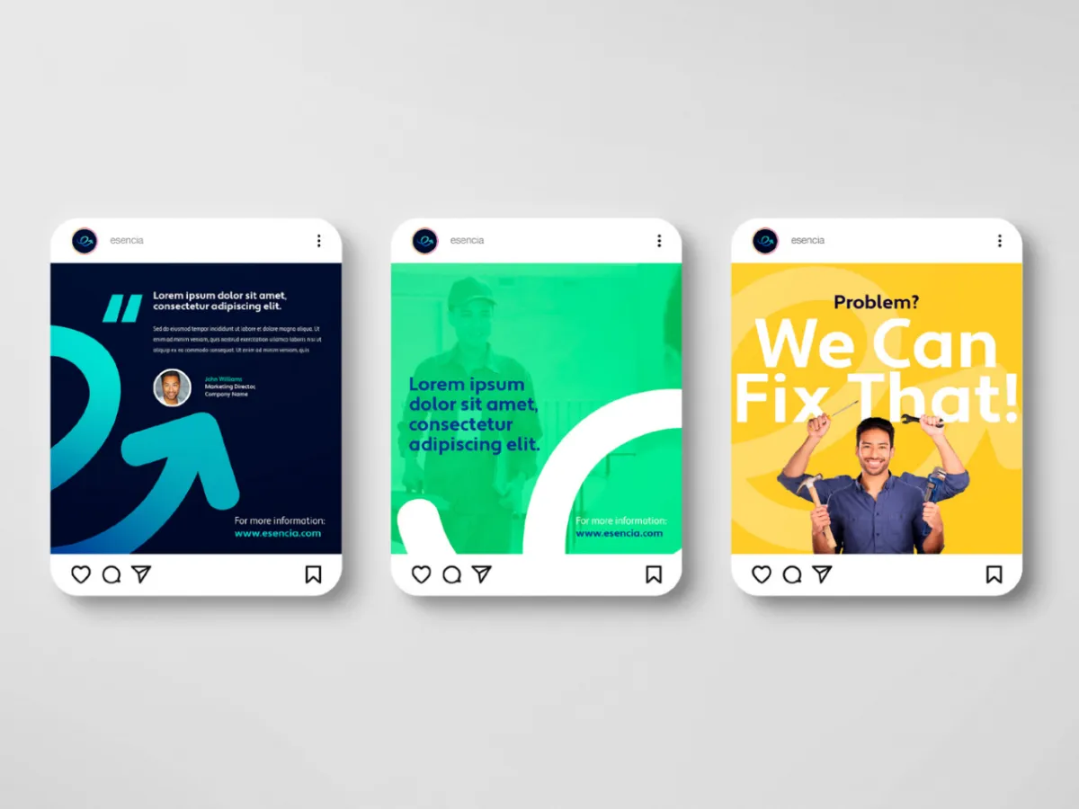
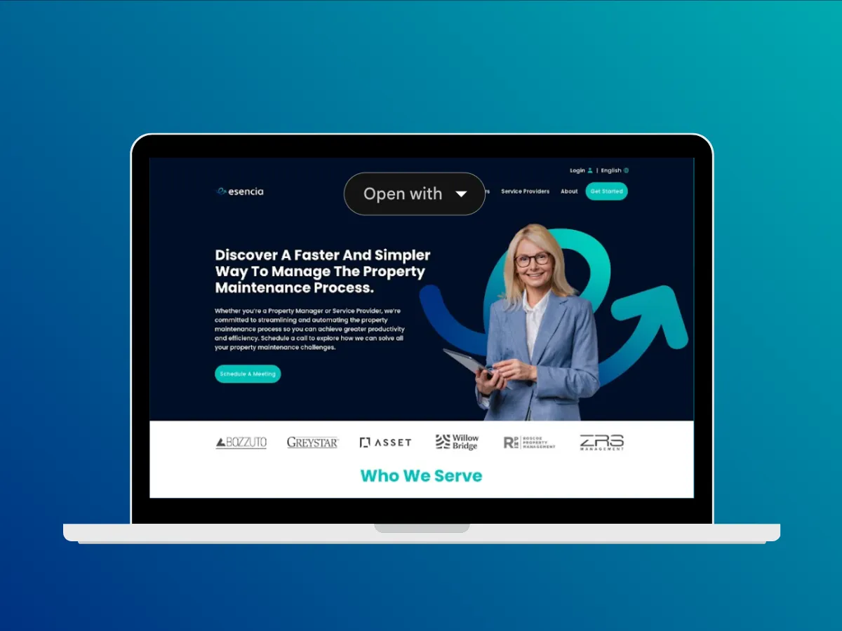
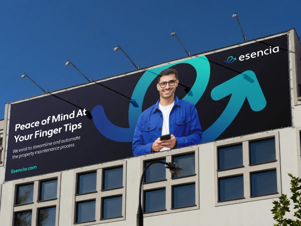
ESENCIA
Making Property Maintenance Effortlessly Simple
The Challenge. Esencia began as a family-run cleaning business, but its rapid evolution into a tech-enabled property maintenance firm left its brand behind. The original identity failed to reflect the sophistication of their smart-technology integration or their expansion into a full-spectrum service provider. To attract premium property managers and scale nationally, they needed to shed their "small business" image for a high-performance brand.
The Strategy & Execution. We partnered to architect a brand that honored their foundational roots while pivoting toward a future of innovation and premium service.
> Identity Architecture: Crafted a bold, modern visual system that positions them as a tech-forward leader in a traditional industry.
> Strategic Evolution: Reimagined the brand story from "manual labor" to "effortless simplicity," focusing on the peace of mind they provide to property managers.
> Market Positioning: Engineered a presence that reflects leadership and sophistication, designed to command authority in competitive markets.
The Result. The transformation fueled a period of explosive growth. With a brand that finally matched their innovation, Esencia secured a prestigious spot on the Inc. 5000 list of America’s fastest-growing private companies, solidifying their status as an industry powerhouse.
The Before
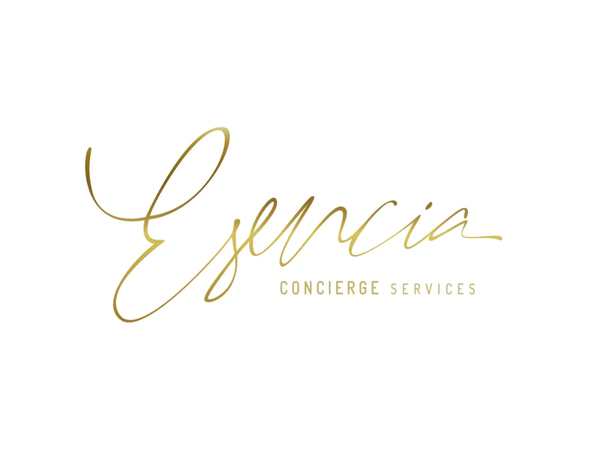
The After
CASE STUDY
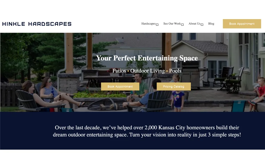
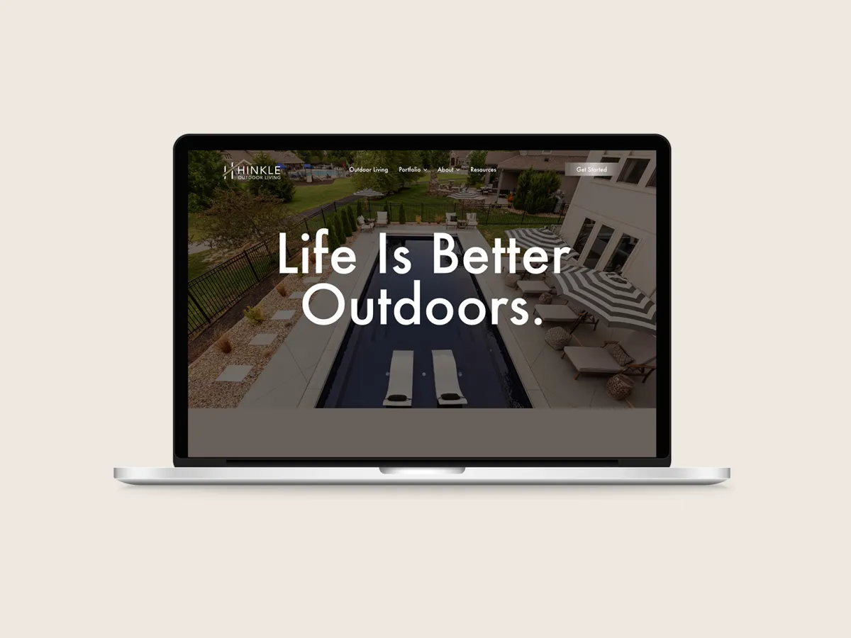
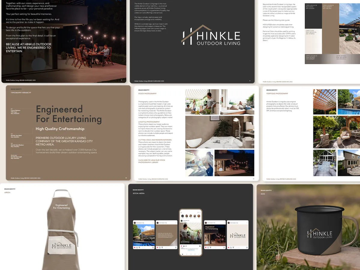
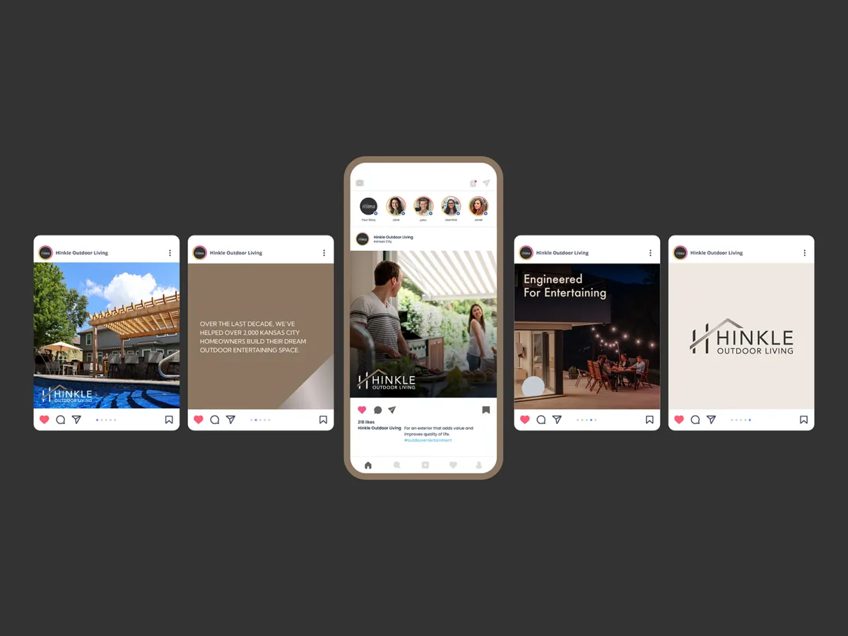
HINKLE OUTDOOR LIVING
Engineered To Entertain
To be added
The Before
The After
CASE STUDY
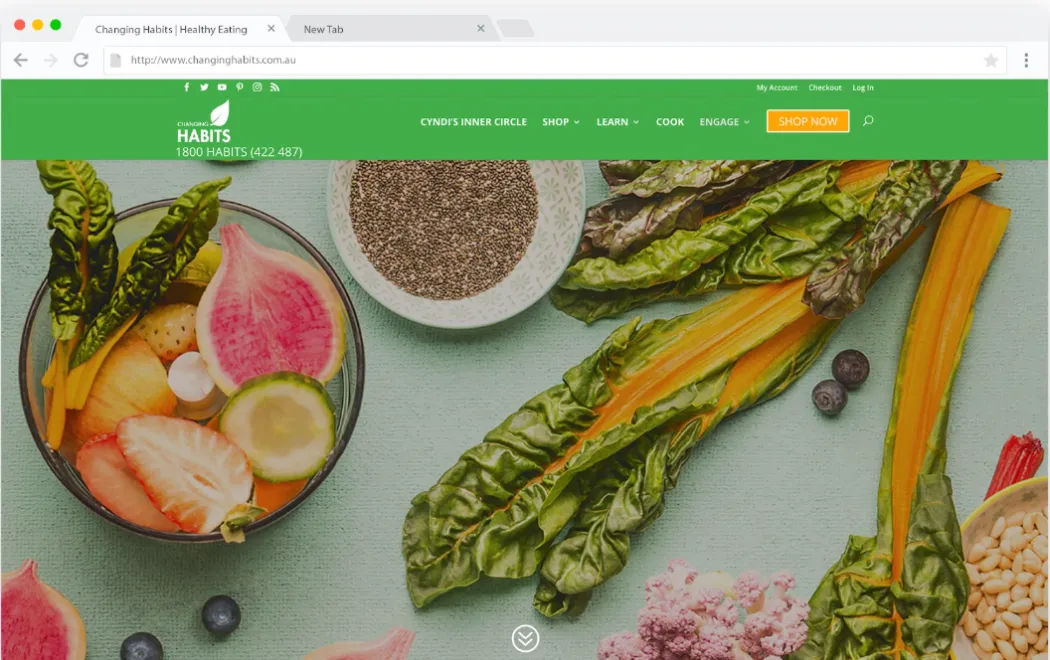
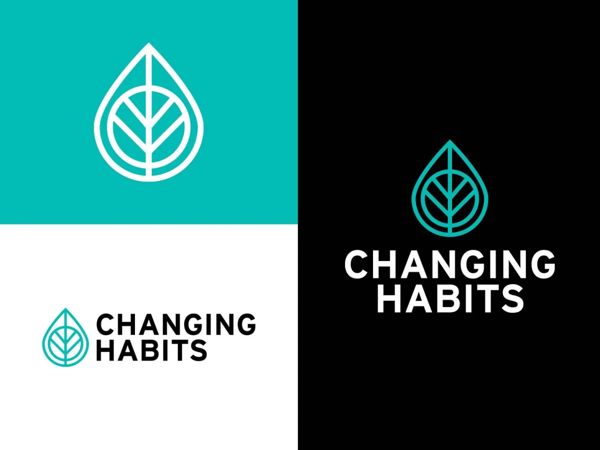
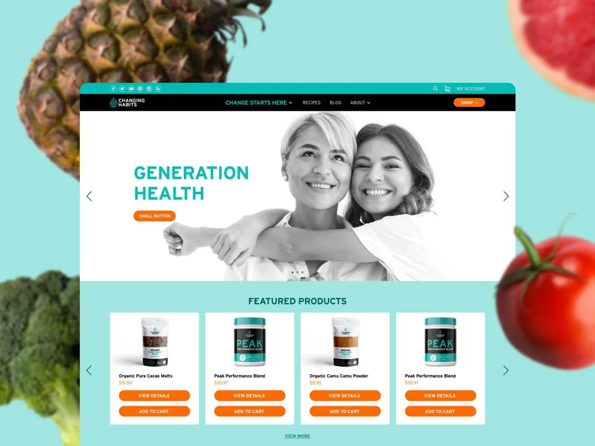
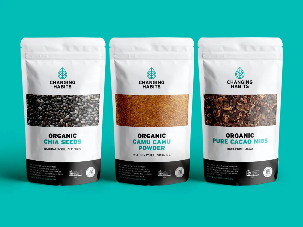
CHANGING HABITS
Helping the World Eat Better Through Real Food
The Challenge. As Changing Habits grew into a trusted authority in whole-food nutrition, its rapid expansion created a fragmented brand. With multiple product lines and programs pulling in different directions, the brand’s core message was becoming diluted. To truly challenge the "diet of misinformation" on a global scale, they needed a unified, high-authority presence that could house their entire ecosystem under one cohesive vision.
The Strategy & Execution. We led a comprehensive transformation to consolidate their influence and align their mission. The focus was on building a singular "Brand Platform" that could support diverse product lines while maintaining a clear, powerful voice.
> Masterbrand Unification: Aligned multiple sub-brands and programs under one cohesive identity to eliminate market confusion.
> Messaging Architecture: Crafted a bold, "anti-hype" narrative that honors their credibility and positions them as a trusted voice for real food.
> Identity Overhaul: Developed a modern, authoritative visual system that stands out against the clutter of the health and wellness industry.
The Result. Changing Habits now speaks with a singular, powerful voice. By aligning their identity with their global mission, the brand has solidified its trust and expanded its reach, positioning the company as the definitive leader in the movement for intentional, real-food living.
The Before
The After
CASE STUDY
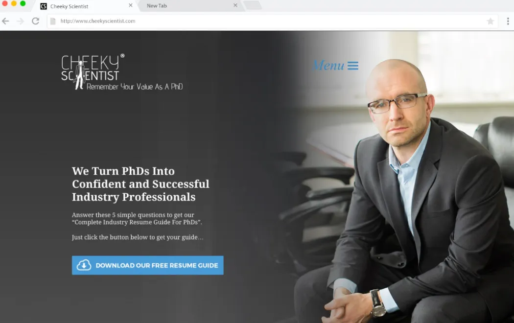
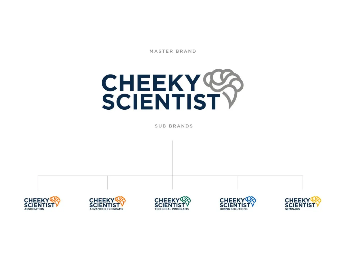
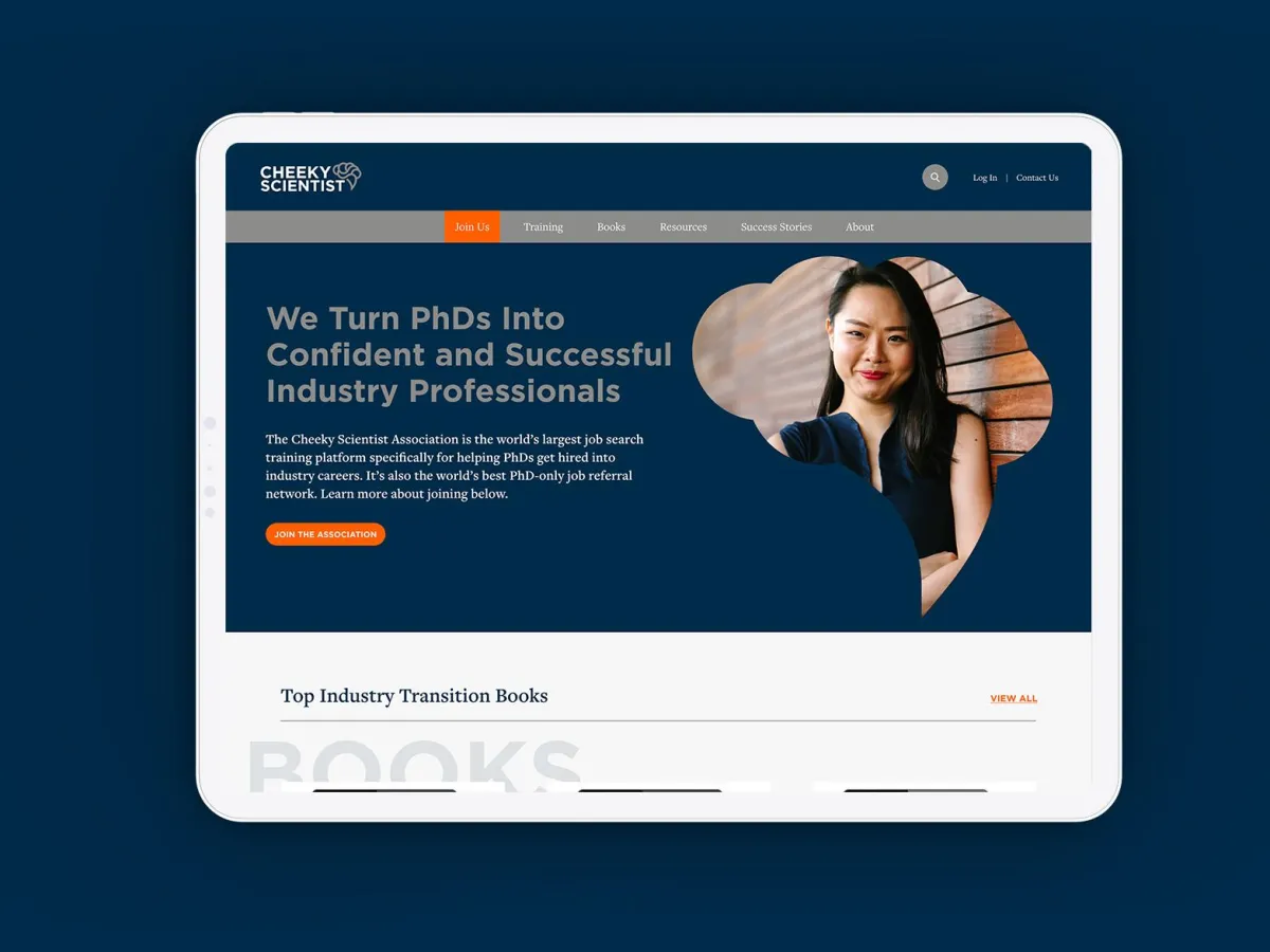
CHEEKY SCIENTIST
The World’s Largest Job-Search Training Platform for PhDs
The Challenge. Cheeky Scientist had built a massive global movement helping PhDs transition into industry careers, but its brand was lagging behind its impact. A cluttered, confusing presence was diluting the organization's credibility and hindering engagement with its highly academic audience. To achieve the bold vision of placing one million PhDs in meaningful careers, the brand needed to evolve from a "training site" to a high-authority global community.
The Strategy & Execution. We led a complete brand transformation to align their visual and strategic presence with the sophistication of their members. The goal was to replace clutter with clarity and authority.
> Strategic Alignment: Refined the brand strategy to focus on the high-level professional transition from academia to industry leadership.
> Identity Elevation: Developed a revitalized visual identity that commands respect and resonates with a global network of specialized scientists.
> Experience Optimization: Streamlined the digital presence to deepen member connection and provide a cohesive, professional user journey.
The Result. The transformation has solidified Cheeky Scientist’s position as the definitive leader in its field. With a brand that now mirrors its massive scale, the organization is accelerating toward its mission with the clarity and authority needed to influence a global workforce.
The Before
The After

CASE STUDY
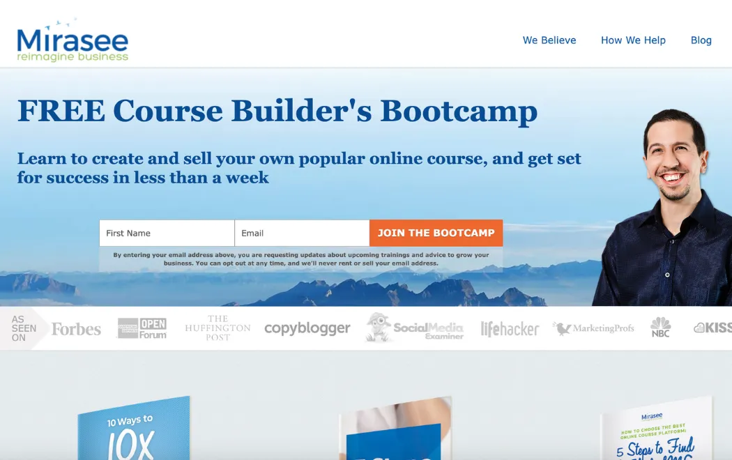
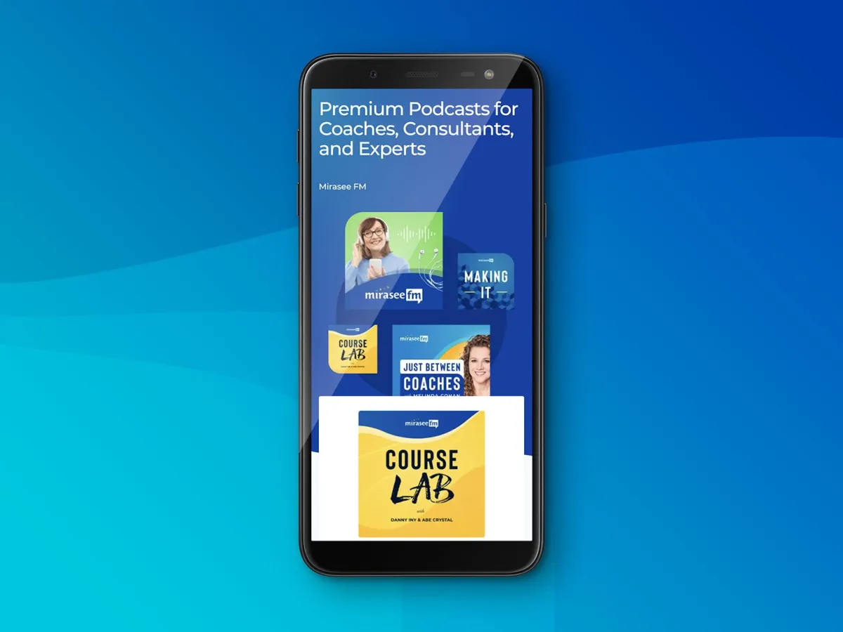
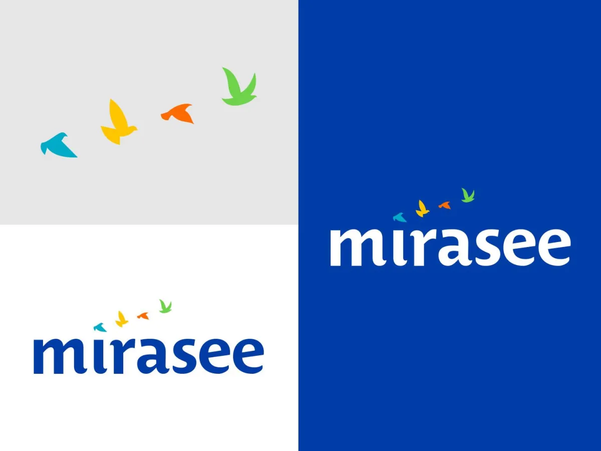
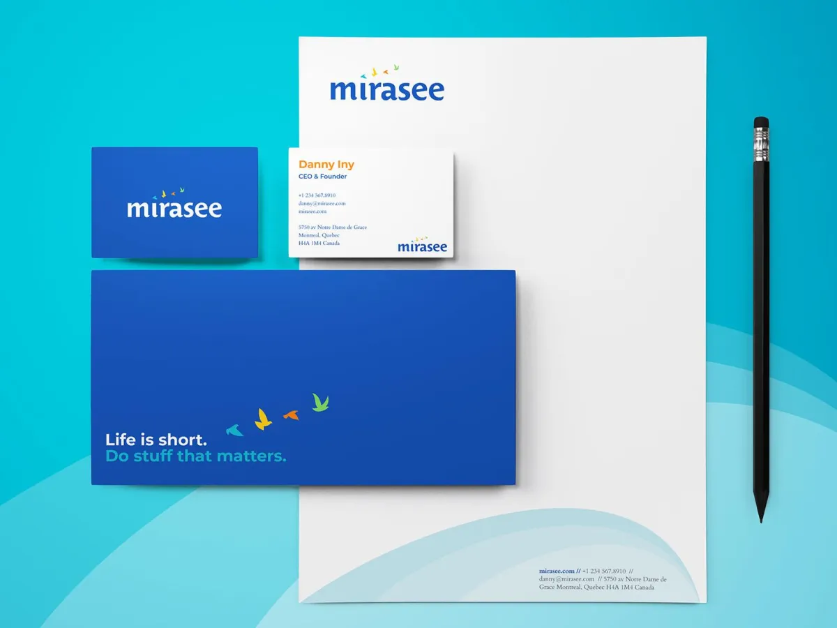
MIRASEE
From Fragmented Offerings to a Unified Industry Leader
The Challenge. As Mirasee scaled through rapid acquisitions and expanded its course offerings, it hit a critical ceiling: a fragmented brand architecture. The complexity was beginning to threaten market clarity and operational cohesion. To future-proof the business, Mirasee needed a brand system that could house multiple sub-entities without losing the strength and reputation of the parent company.
The Strategy & Execution. We partnered to design a comprehensive Brand Evolution that prioritized structure and scalability. The focus was on creating a "house of brands" that felt unified yet flexible enough for continued expansion.
> Architecture Design: Developed a clear, strategic framework to align diverse business units and acquisitions under one cohesive vision.
> Identity Refinement: Created a sophisticated visual identity that projects stability, strength, and premium market leadership.
> Systematized Guidelines: Engineered a unified brand playbook to ensure every part of the expanding ecosystem remains in perfect alignment.
The Result. Mirasee now leads the education space with undeniable clarity and structure. By solving the architecture challenge, the brand has solidified its industry leadership and is perfectly positioned for its next phase of global growth and acquisition.
The Before
The After
CASE STUDY
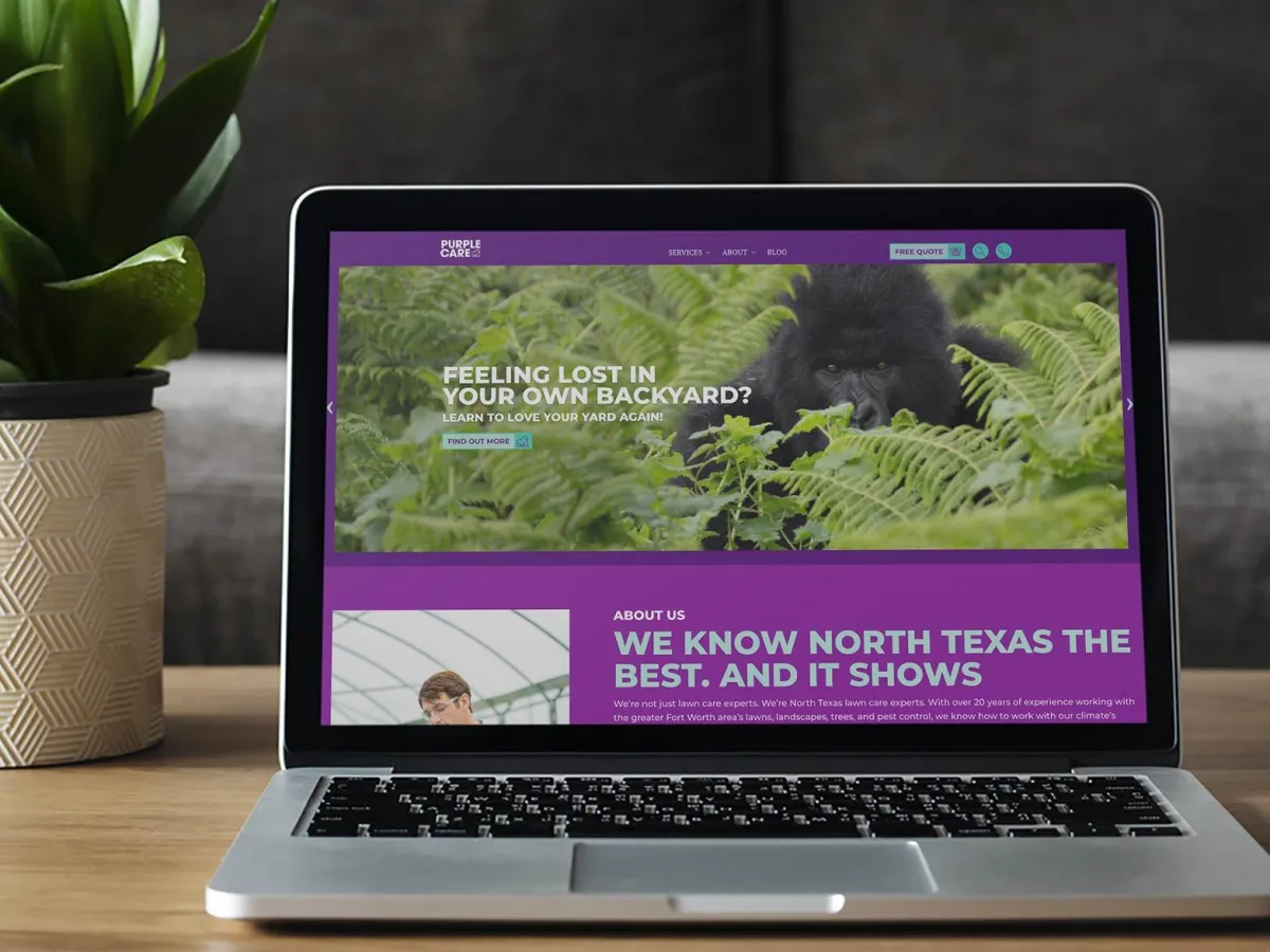
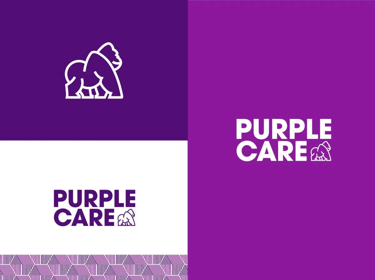
PURPLE CARE
From Fragmented Offerings to a Unified Industry Leader
The Challenge. Formerly known as Xtreme Lawn Care, the company was hindered by a generic brand that failed to reflect its holistic, high-quality approach. Despite a strong local following, the "Xtreme" branding was causing customer confusion and capping growth. CEO Justin Berg needed to move away from a commodity service image to an unforgettable, premium brand that could dominate the competitive Fort Worth market.
The Strategy & Execution. We led a radical rebranding strategy designed to maximize memorability and clarify the company’s promise of "greener communities."
> Strategic Repositioning: Transitioned the brand from a standard lawn service to Purple Care, a name that commands attention and implies a superior level of care.
> Character Development: Introduced "Puck," a bold purple gorilla mascot, to infuse the brand with unmistakable personality and a high "recall" factor in the local community.
> Identity & Digital Overhaul: Developed a modern, high-contrast visual identity and website that elevated the brand from a local contractor to a market leader.
The Result. The transformation ignited a massive scaling phase. Since the rebrand, Purple Care has exploded from 100 to 2,000 customers—a 1,900% increase—solidifying its position as the undisputed market leader in its region.
The Before

The After

READY TO BUILD A CATEGORY OF ONE BRAND?
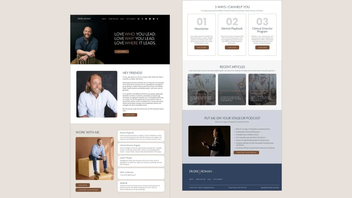
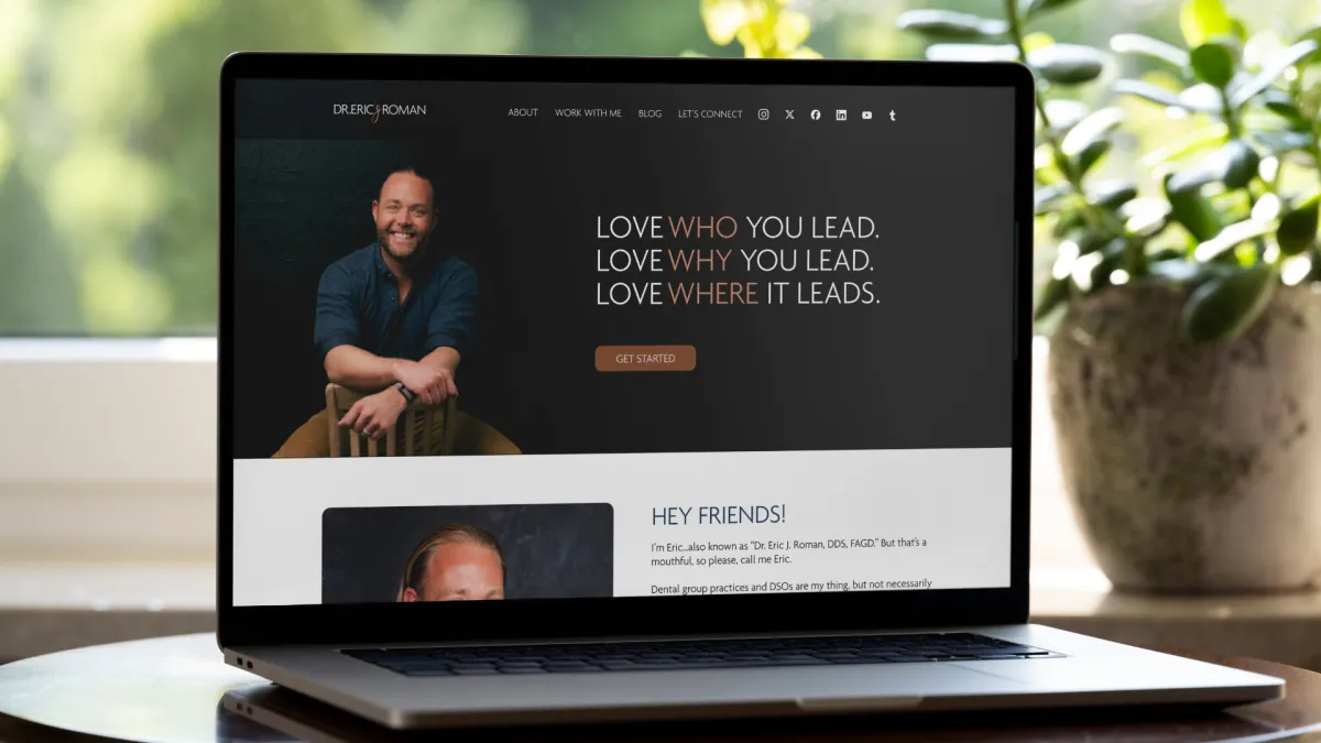
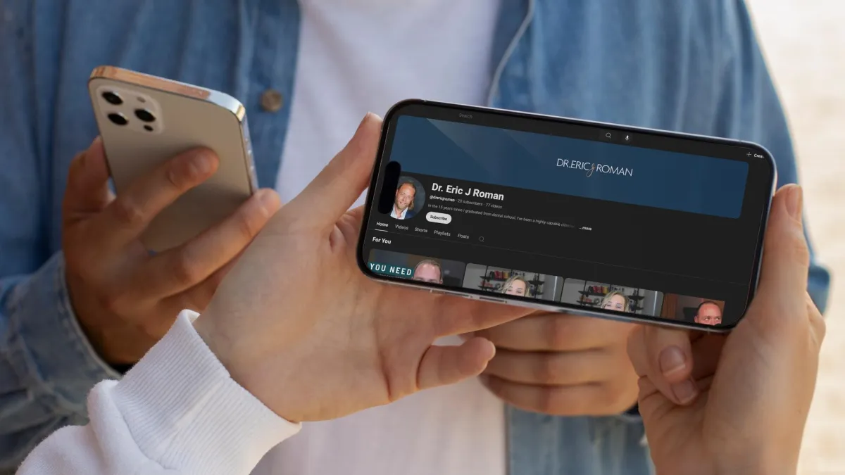
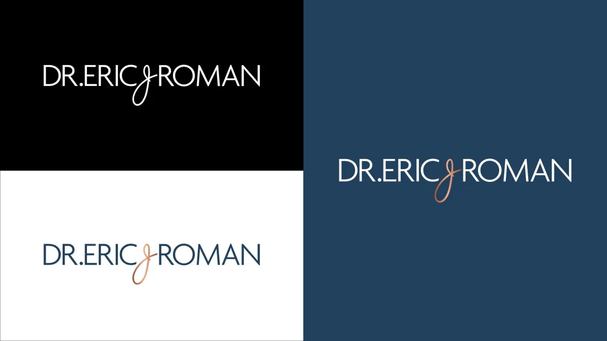
DR. ERIC J. ROMAN
Transforming the lives of growing dental companies.
Dr. Eric J. Roman, a respected entrepreneur and leader in the dental and DSO space, had already built two thriving dental groups and coached high-level executives managing hundreds of millions in care. Ready to expand his impact beyond the industry’s walls, he turned to Re Perez to clarify his message, define his positioning, and architect a compelling online Personal Brand. The transformation provided Eric with a magnetic platform that reflects the depth of his insight and leadership. Within just one month of launching, he achieved a 4x return on his branding investment—laying the groundwork for even greater influence and long-term ROI.
New Brand

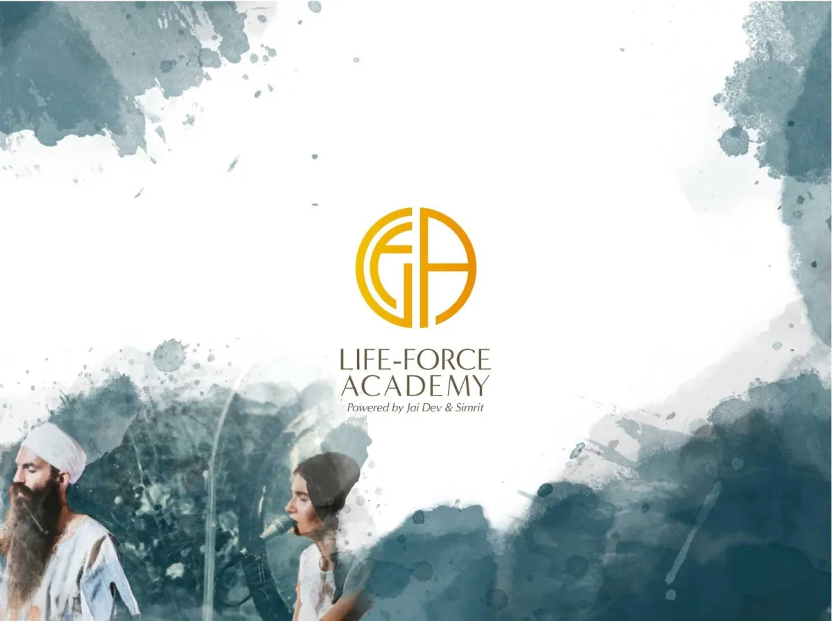
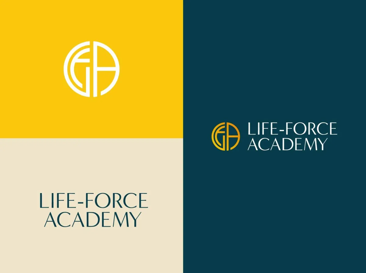
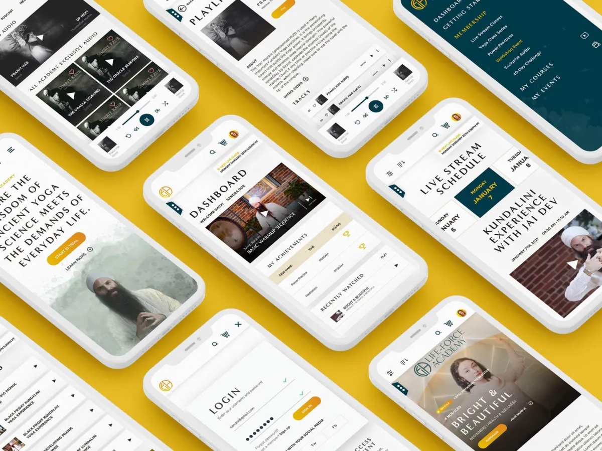
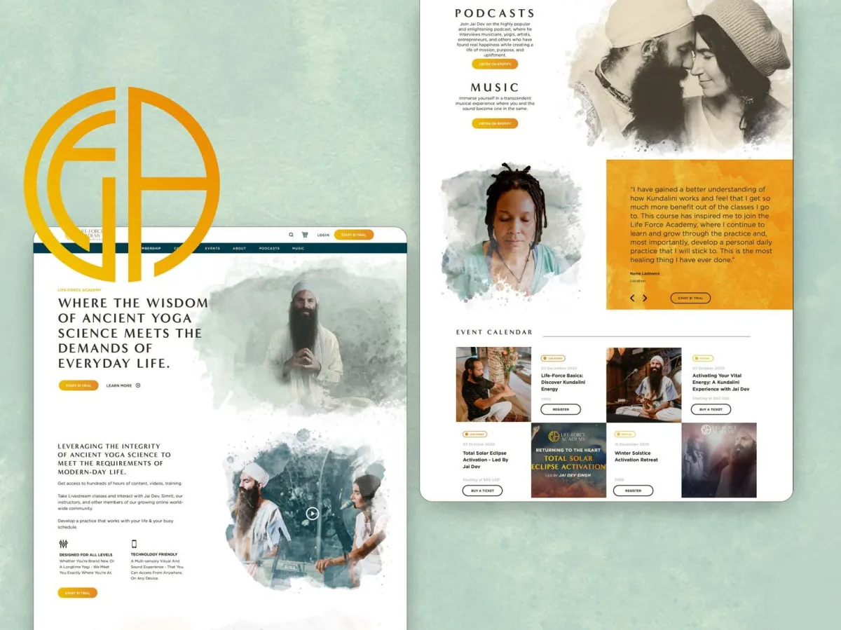
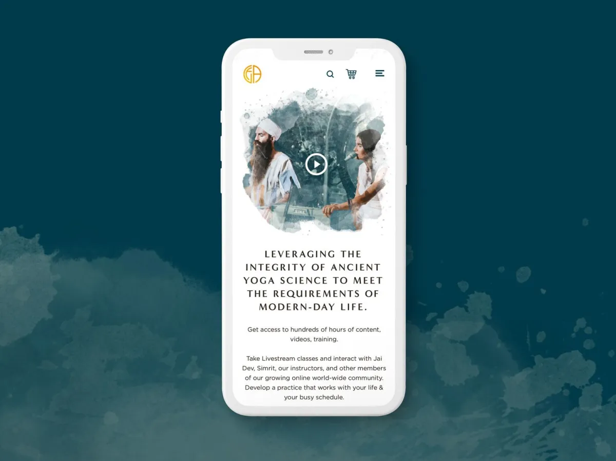
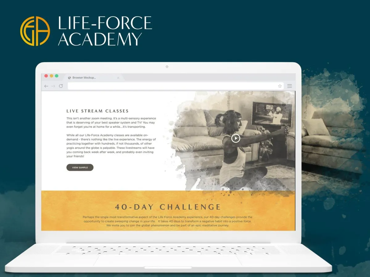
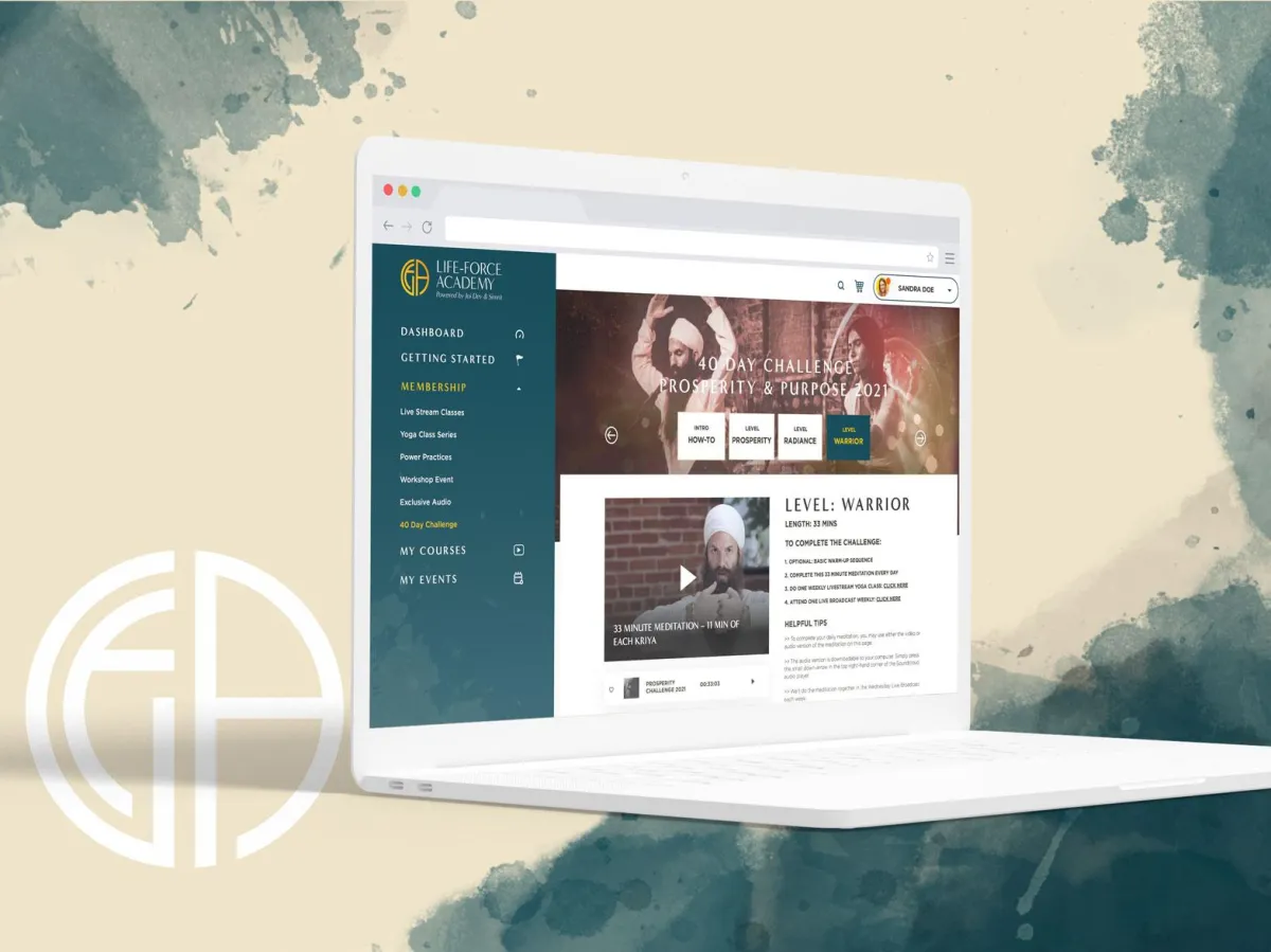
LIFE-FORCE ACADEMY
Making ancient yoga teachings more accessible
Life-Force Academy, founded by Jai Dev Singh, had already established itself as the world’s premier online Kundalini yoga experience—offering a dynamic blend of guided practices, live events, and music rooted in ancient yogic wisdom. With a strong reputation and loyal global following, the brand was poised for even greater impact. To support its growth, Life-Force Academy partnered with Re Perez to bring strategic clarity and cohesion across its various brand expressions. The result was a unified brand foundation designed to streamline messaging and guide future marketing decisions—ensuring the brand’s essence remains intact as it scales.
New Brand

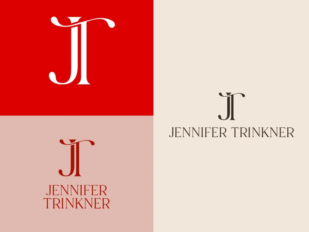
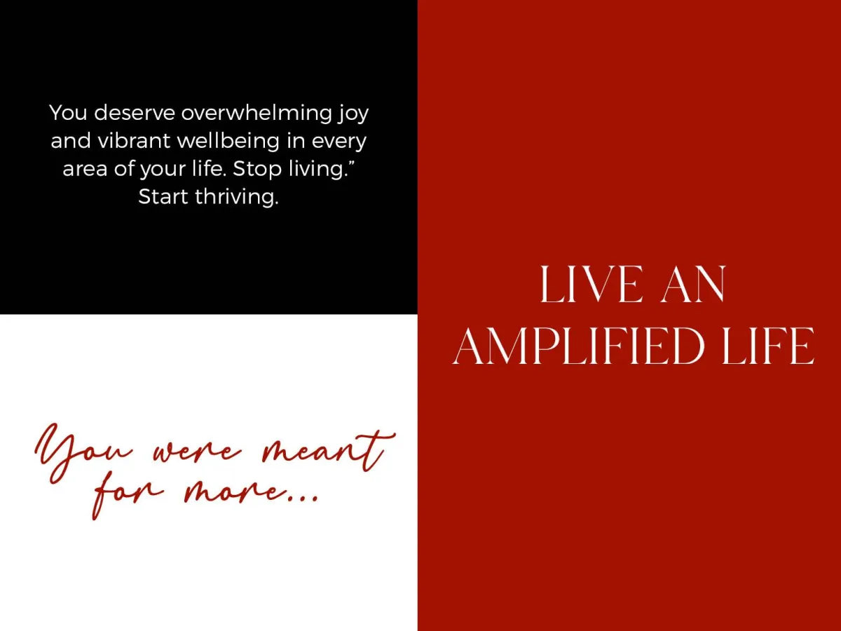
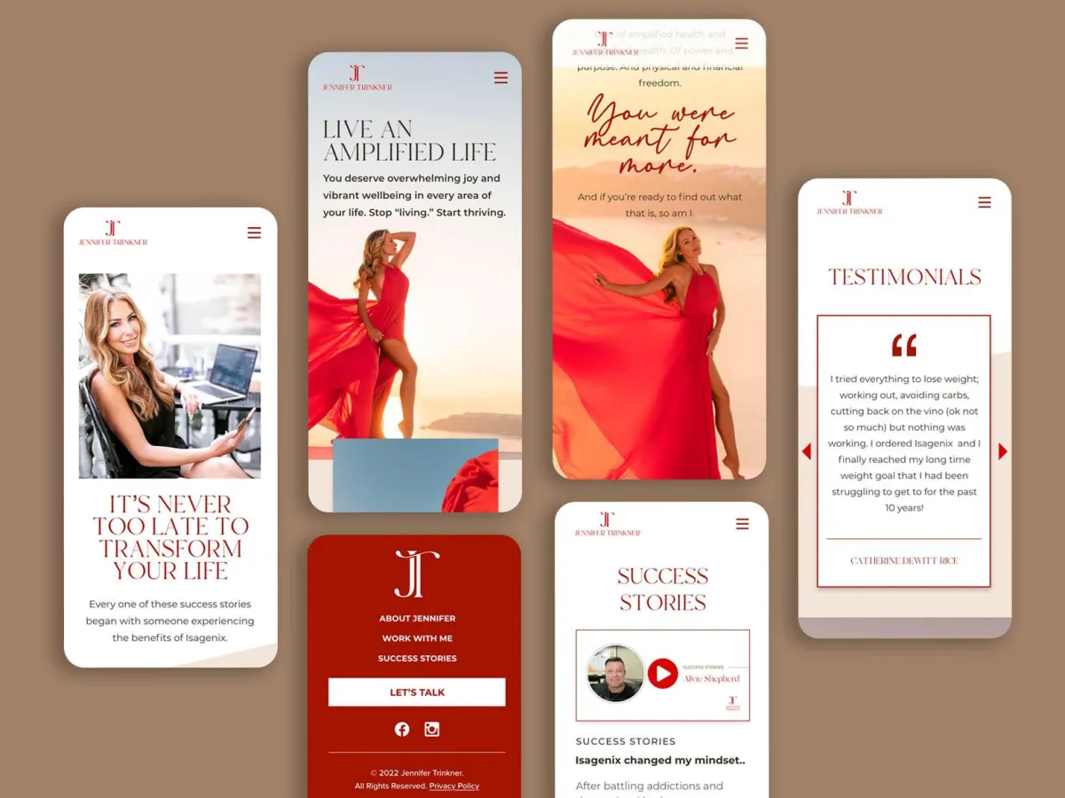
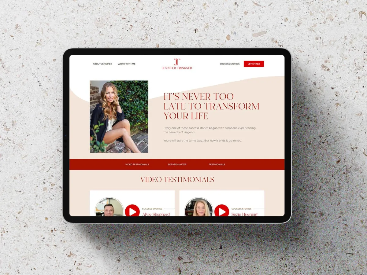
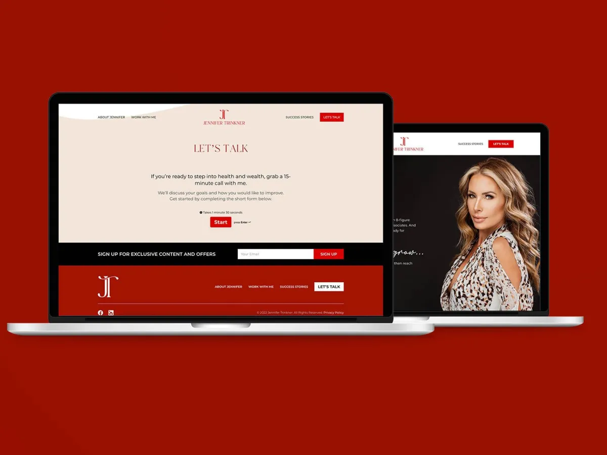
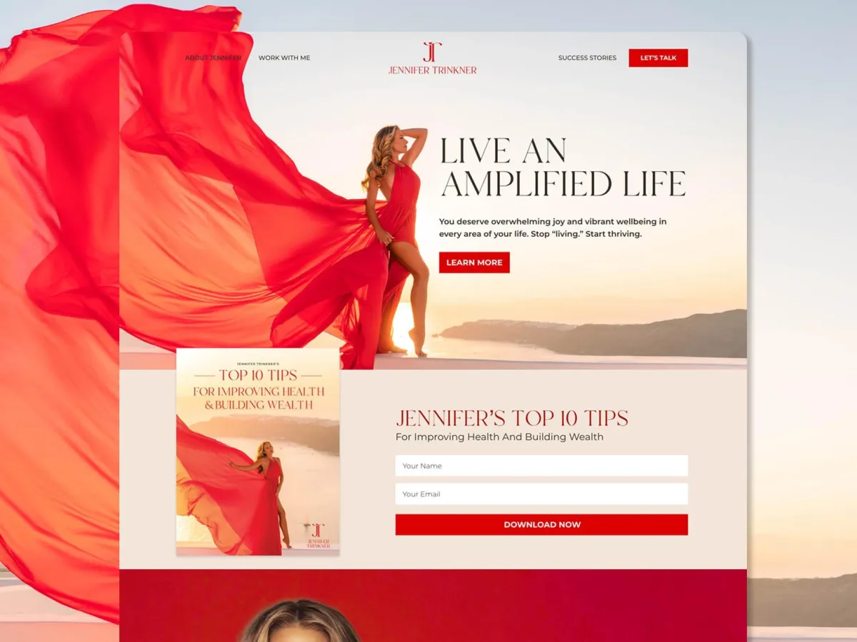
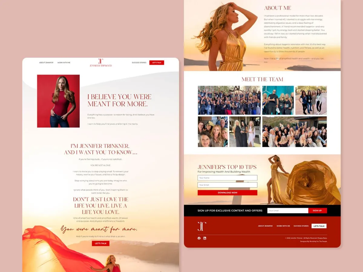
JENNIFER TRINKNER
Amplifying your health and wealth.
Jennifer Trinkner, a former professional model and top Isagenix producer, came to Re Perez with a bold goal: to clarify her personal brand and rise to #1 within the company. Already ranked in the top 10, Jennifer knew that refining her message and platform was key to amplifying her impact. Together, we shaped a personal brand that reflected her authenticity, leadership, and deep belief in Isagenix as a powerful path to better health, fitness, and purpose. The result is a magnetic brand that positions her to inspire thousands—and claim the top spot she’s been called to lead.
New Brand

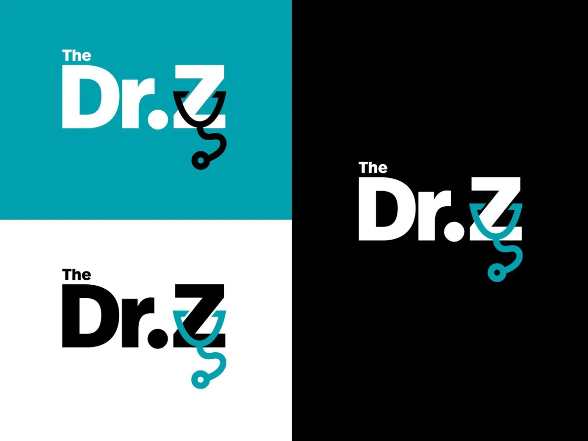
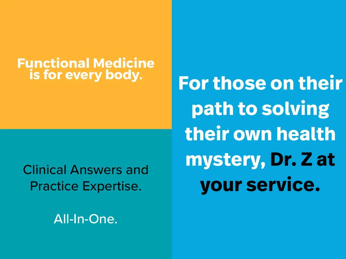
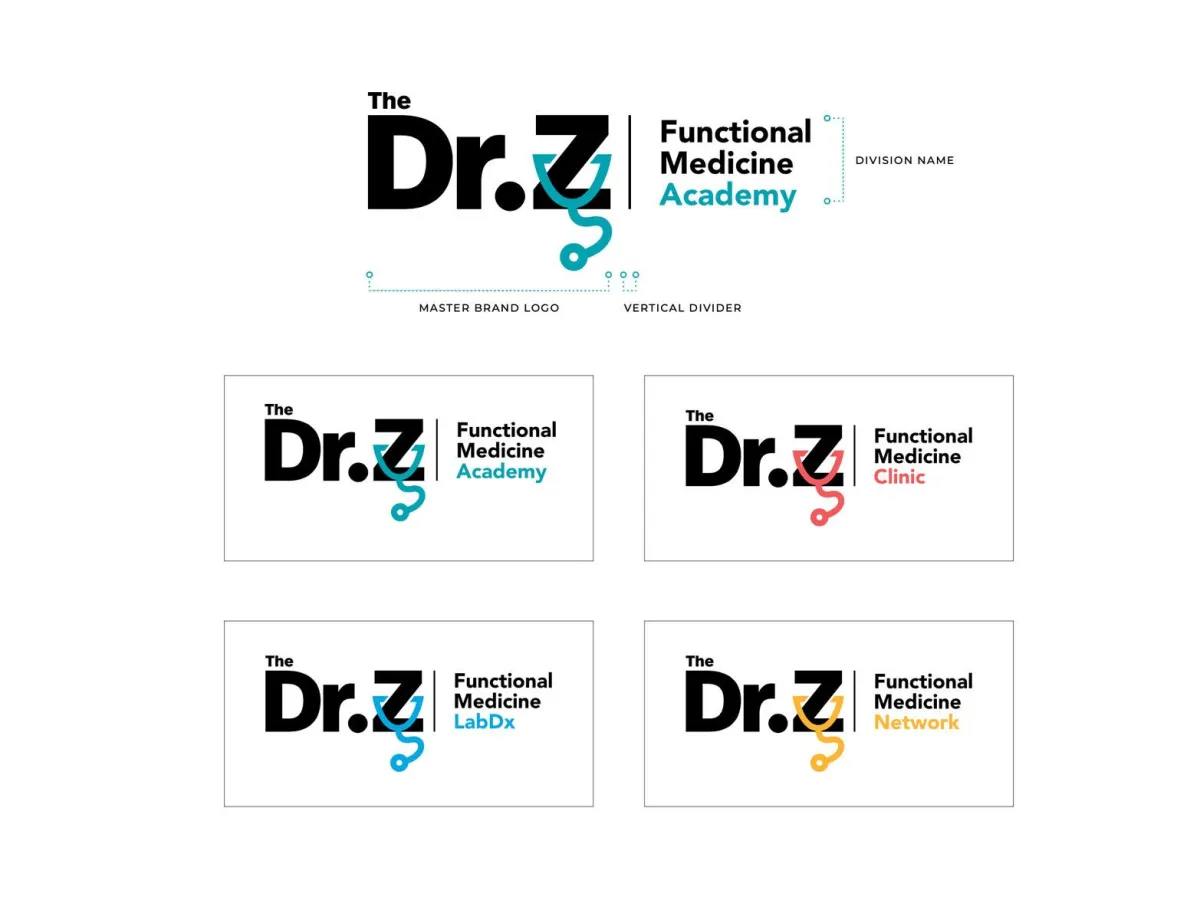
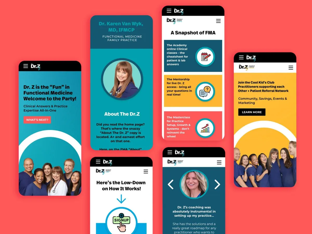
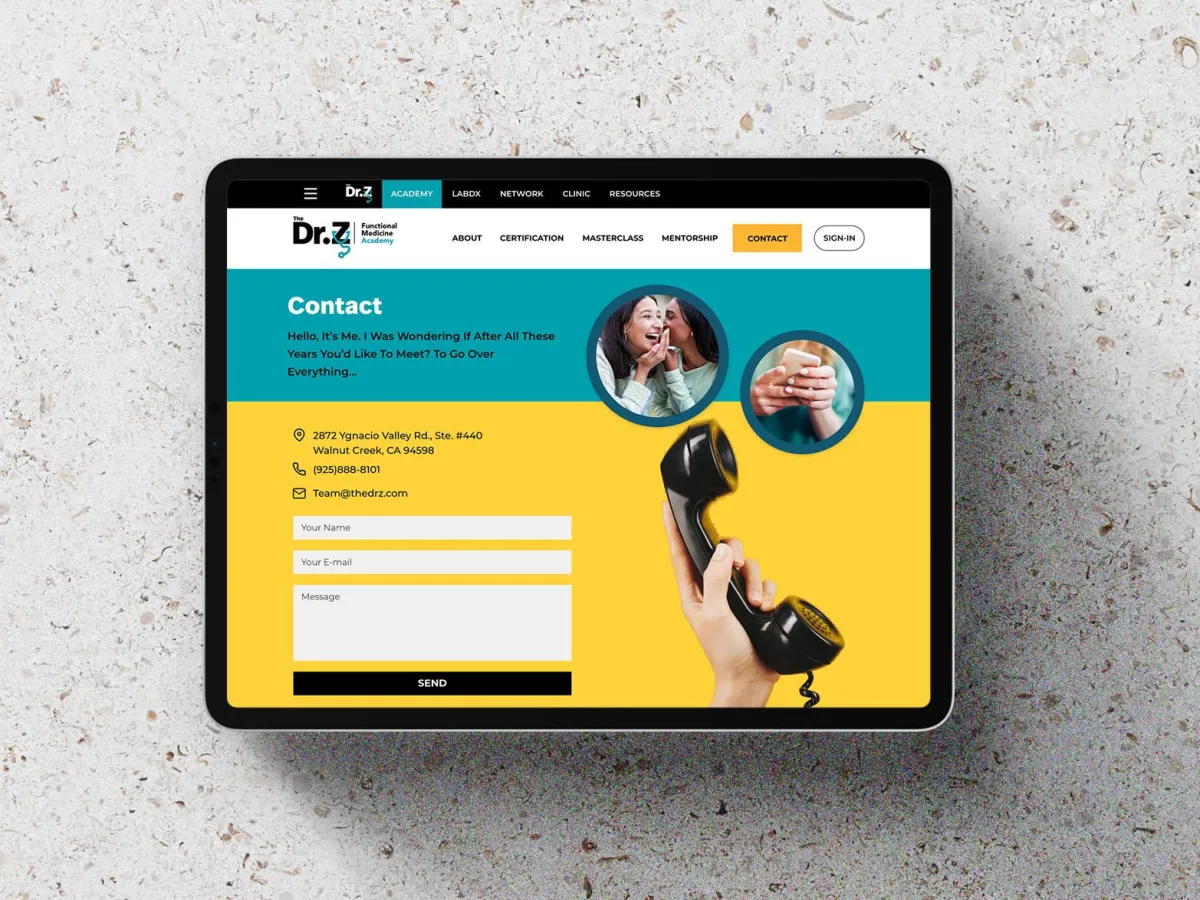
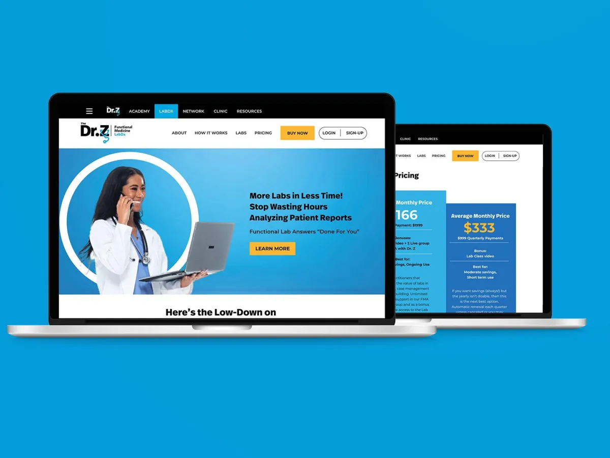
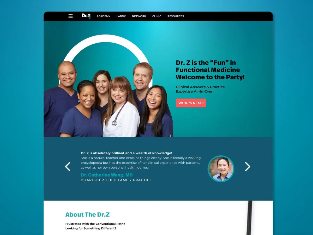
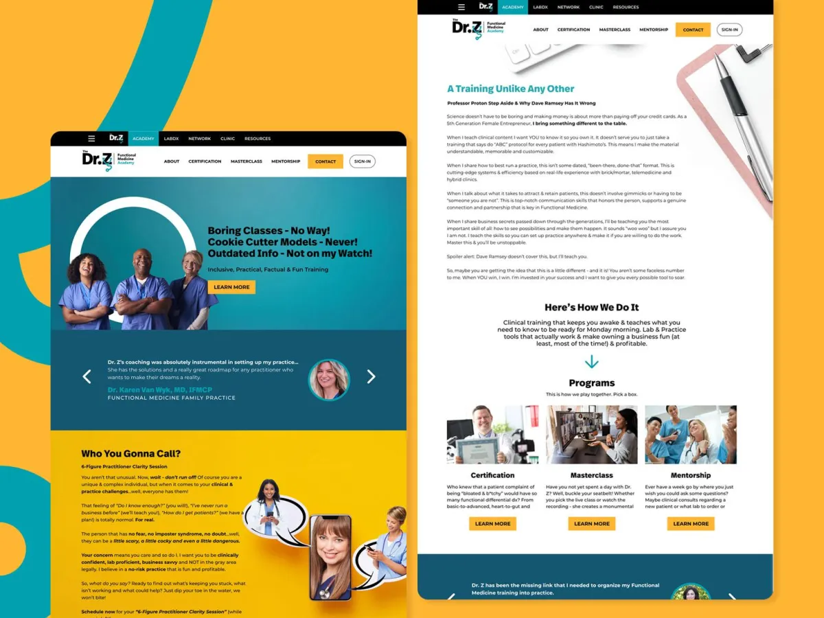
THE DR. Z
Making Functional Medicine accessible and actionable for more people.
Dr. Brandy is a well-established Functional Medicine doctor, who was looking to streamline and create more synergies between three of her different businesses (and potentially sell one of them). She pioneered an online platform dedicated to helping functional medicine practitioners and people manage their health and well-being via the wisdom of functional medicine. Re Perez partnered with Dr. Brandy to rebrand her business under one umbrella brand. We renamed her business to just ‘The Dr. Z’. In early stages of launching her new brand, she has sold one of her businesses and is now well poised with a solid brand foundation to drive faster business growth.
New Brand

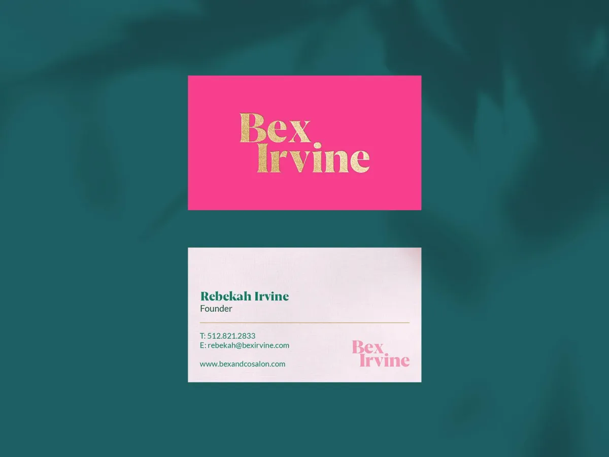
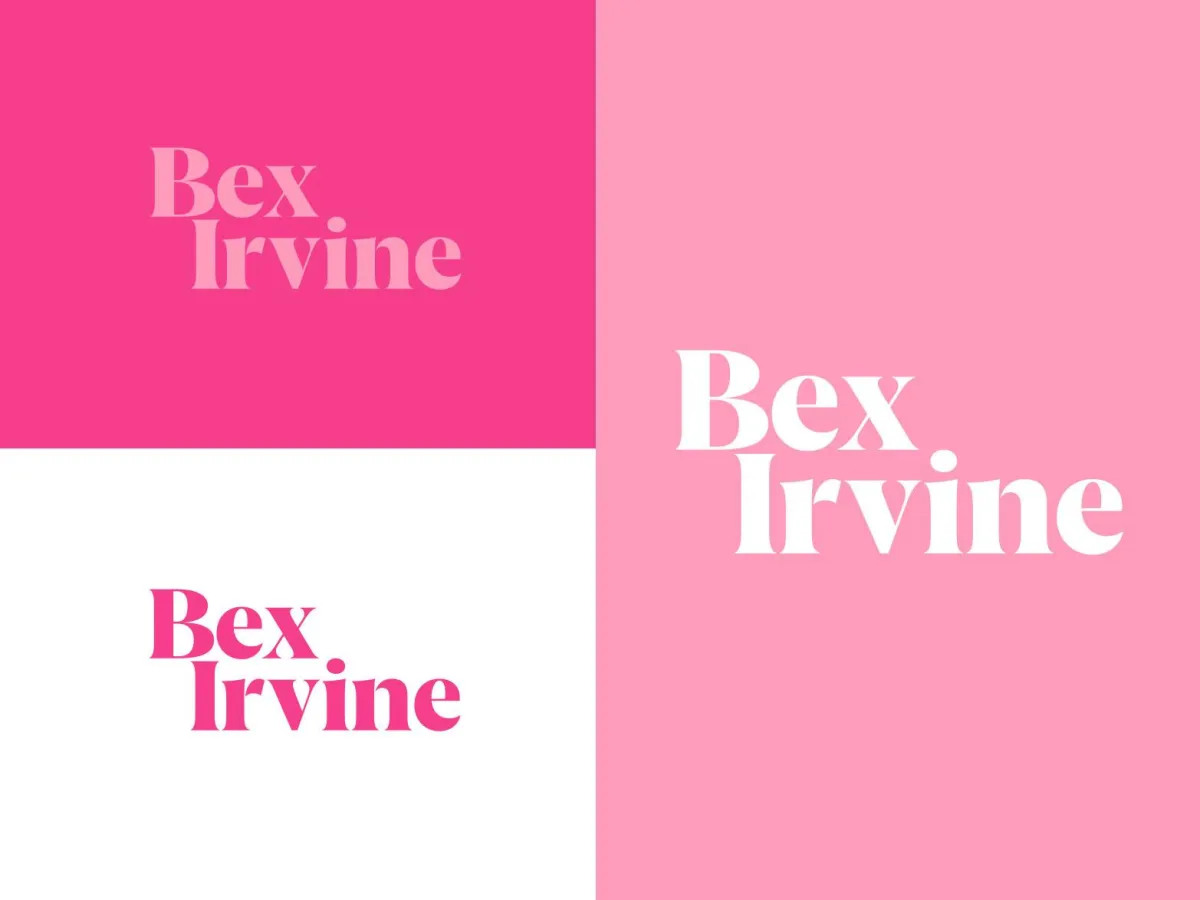
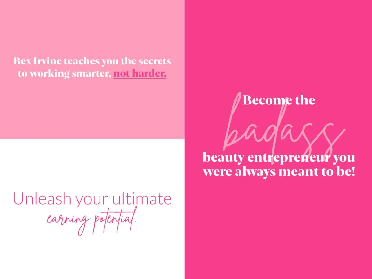
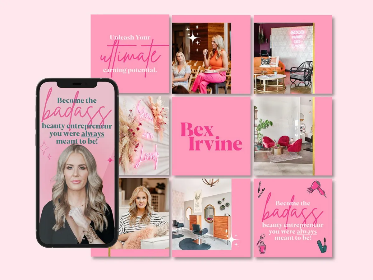
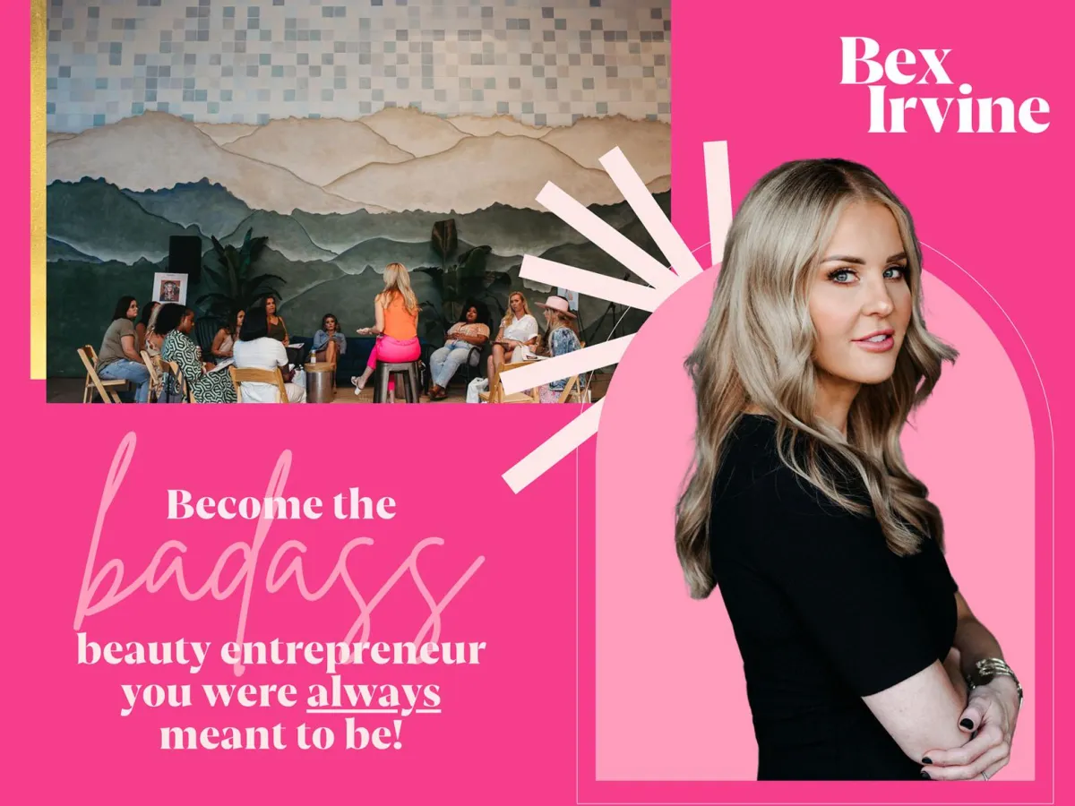
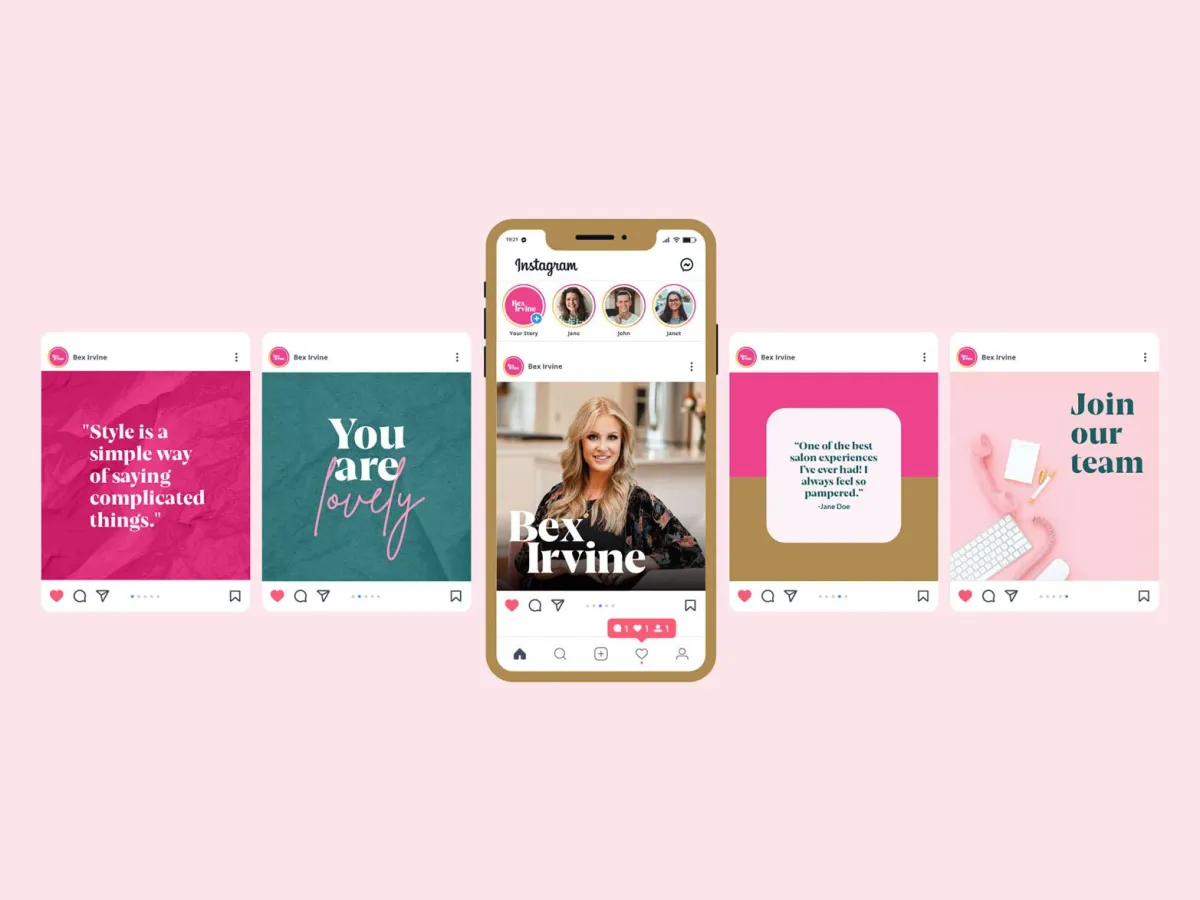
BEX IRVINE
Unlocking the full potential of beauty entrepreneurs.
Bex Irvine, the powerhouse behind bex+Co salons, knows firsthand how branding can fuel business success. Eager to expand her impact beyond the chair, she partnered with Re Perez to craft a Personal Brand that captures her vibrant personality, bold business model, and relationship-first approach. With a proven track record and an abundance mindset, Bex is now mentoring beauty professionals and salon owners to build thriving, values-driven businesses. The result is a magnetic brand presence that positions her as the go-to coach for entrepreneurs in the beauty industry, empowering others to create the success she’s already mastered.
New Brand

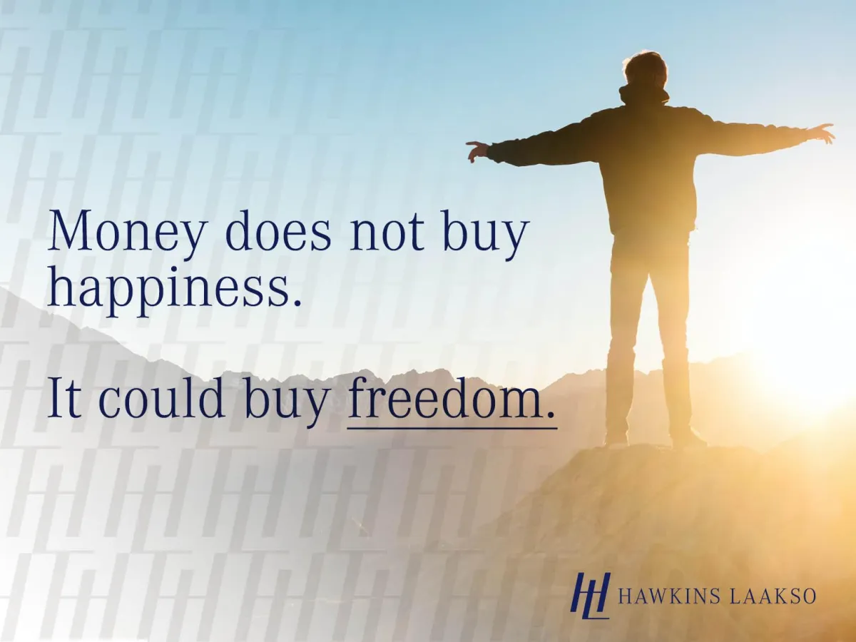
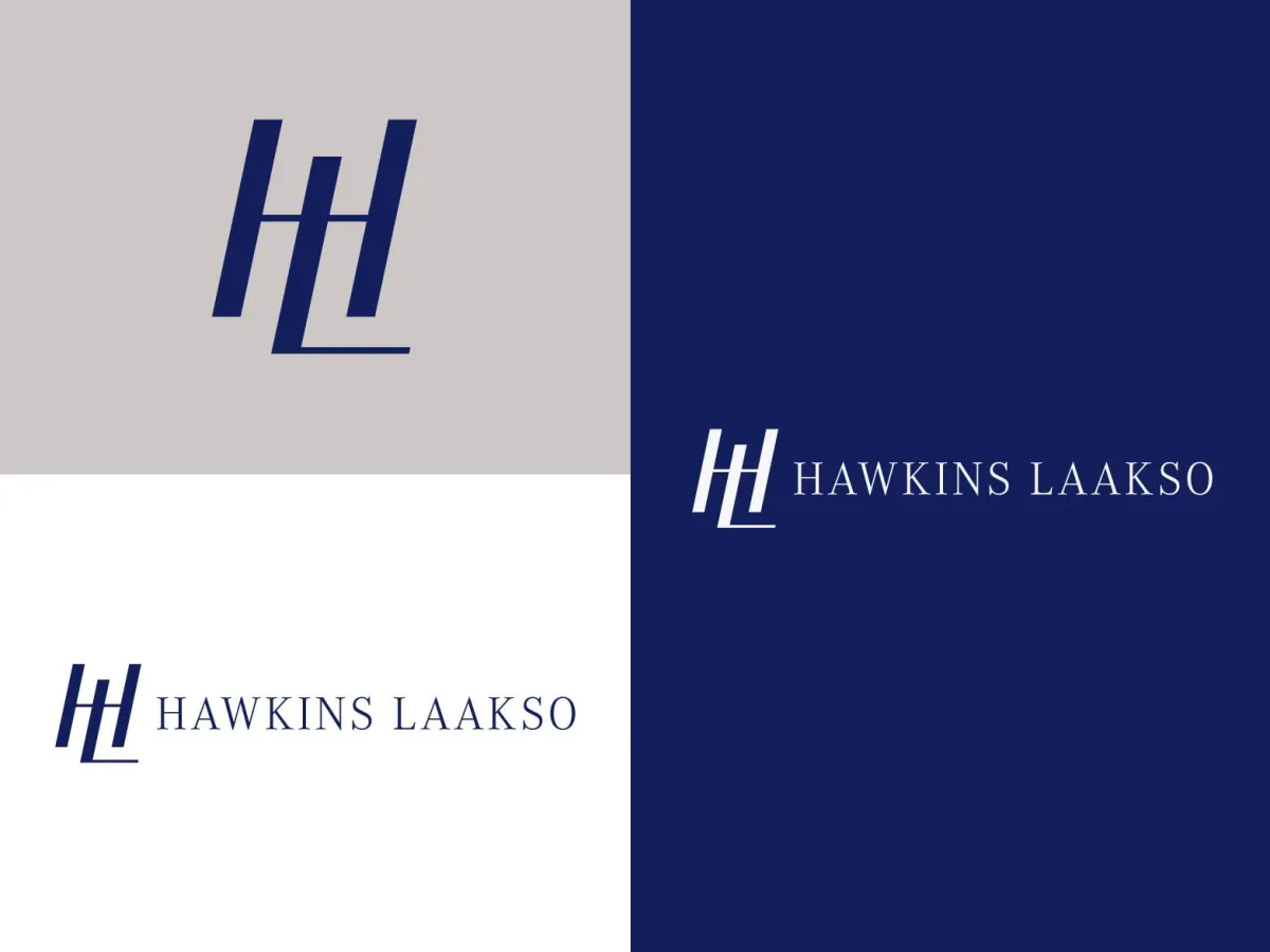
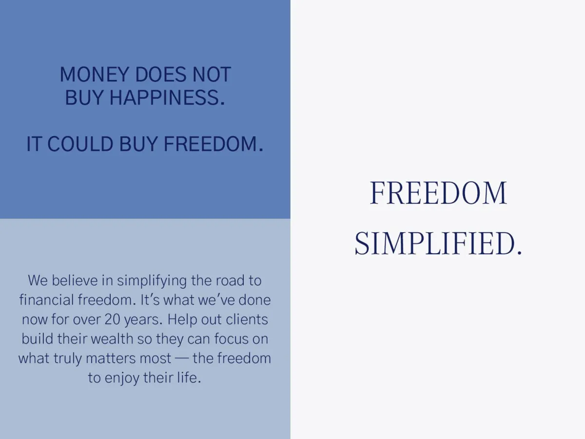
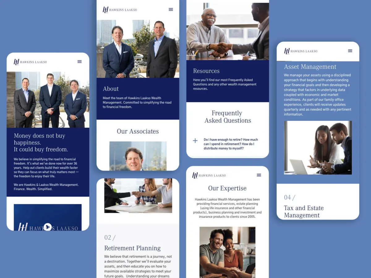
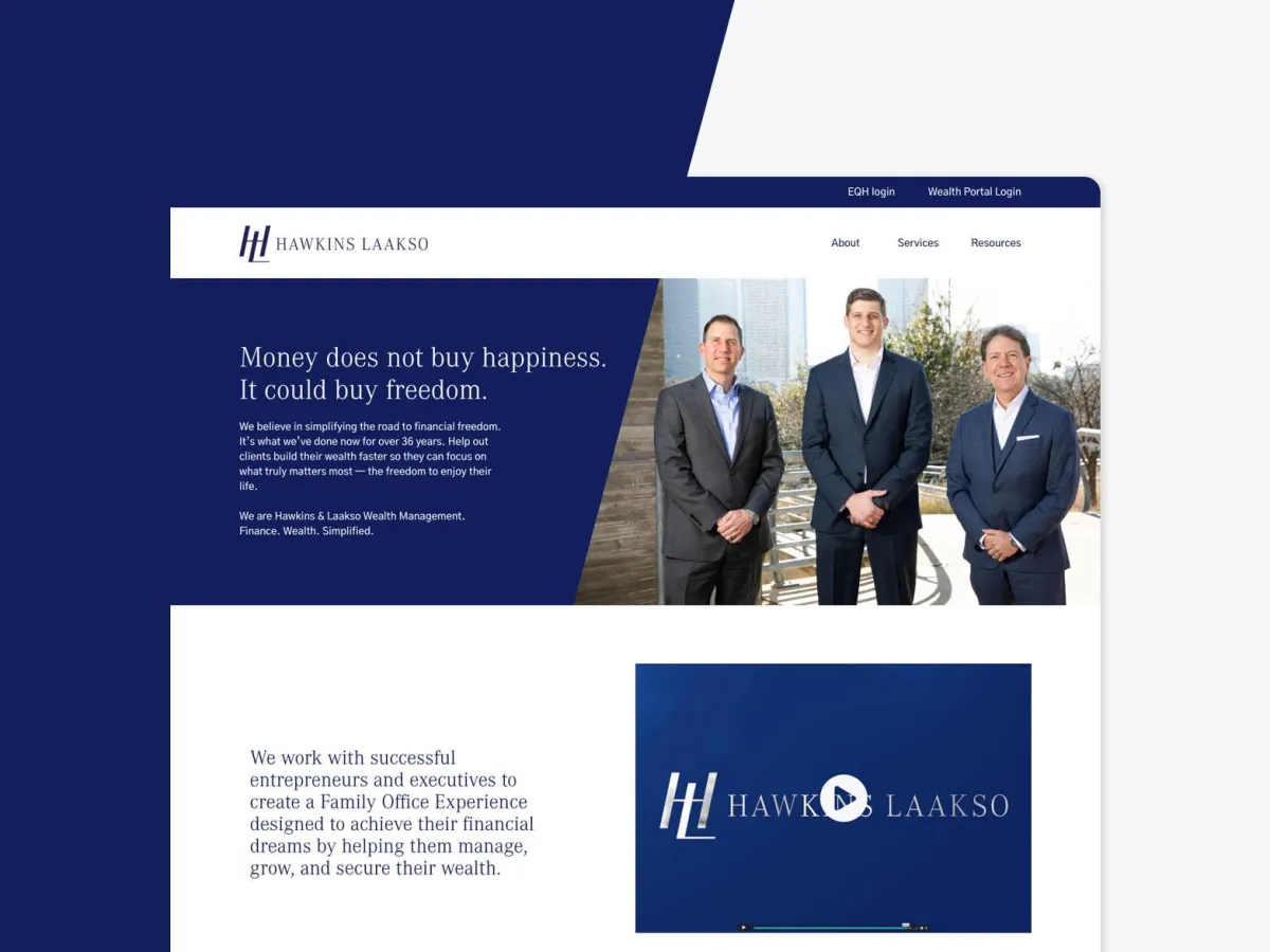
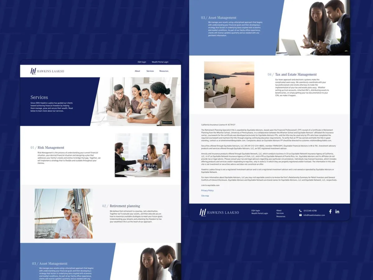
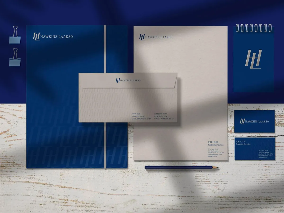
HAWKINS LAAKSO
Simplifying the road to financial freedom.
Hawkins Laakso, a sophisticated wealth management firm known for navigating complex financial landscapes, approached Re Perez with a clear challenge—their brand no longer reflected their caliber or direction. Despite delivering exceptional results, their identity felt dated and uninspired. Through a deeply strategic and creative process, we reimagined their brand to reflect a refined “Park Avenue” experience—one that emphasizes relationship, legacy, and elegance over rigidity. The result is a revitalized brand that positions Hawkins Laakso as the premier provider of a true Family Office Experience—helping clients manage, grow, and secure their wealth while realizing their financial dreams.
New Brand